Exploring NYC: from Nolita to Harlem
When I lived in NYC, I spent almost every Saturday and Sunday just wondering around. I figured the best way to learn about the city was by a combination of train to a new neighborhood and by foot once I got there. I wanted to spend my birthday the same way.
Plantshed: the retail experience of coffee, plants, planters, flowers, and all the lovely things.
What’s one of my favorite places to explore outside Cincy? New York City! I used to live in the city back in 2012, so every opportunity to go back—even if for a day—I take it. And since you my birthday happened to be around the time we were in Connecticut visiting family, I figured I’d add an extra day to our trip and spend my birthday in the city.
When I lived in NYC, I spent almost every Saturday and Sunday just wondering around. I figured the best way to learn about the city was by a combination of train to a new neighborhood and by foot once I got there. I wanted to spend my birthday the same way. I first met up with a former colleague at the wonderfully designed Mediterranean restaurant Dez in Nolita.
Entry mat to Dez. They really nailed the branding.
Bar area, complete with handmade-look subway tile and plenty of plants.
Parsons-style communal table with detailed legs. We’re also a fan of the cluster of light fixtures above,
Geometric tables and booths add a contrasting element to the otherwise neutral space.
Have you ever seen a cuter trash and recycling area? Yeah, me neither.
Next, we continued walking around Nolita, popping into and out of the small retail shops that line the streets. After a bit of shopping, we stumbled across Plantshed, a plant shop, flower shop, and coffee shop all in one. Genius. Plus it was well designed and had great coffee.
Plantshed | the most genius combination of retail elements.
Coffee bar with waterfall front and so many plants and flowers.
“Spread the plant love.” I fully support this mission.
Eventually, we stumbled upon the cutest of bookstores, Alabaster Bookshop. It was so small, packed to the brim, and had a lovely old book smell.
A colorful mural outside John Fluevog Shoes.
Hola | Oh, Hey.
Alabaster Bookshop. The last bookshop remaining on what was once Book Row on 4th Ave between Astor Place and Union Square. Book Row used to house 48 different bookstores!
After traveling back up to our friend’s apartment in the Upper West Side, we headed to Harlem for my birthday dinner. I lived in Harlem back in 2012, and although it’s a bit different than when I lived there (and I’m definitely not the only person expressing that sentiment), there are a few places in Harlem that are staples of the neighborhood and the people there. Sylvia’s has been in Harlem since 1962, serving authentic and delicious soul food. I first went to Sylvia’s on a high school field trip, went there a few times while living in the city, and couldn’t think of anywhere else I’d want to have my birthday dinner.
Sylvia’s | Soul food in Harlem.
Soul food | fried catfish, collard greens, mac n cheese.
Hope you enjoyed my mini tour of NYC!
The old and the new and plenty of street art.
Exploring Cincy: Cincinnati Shakespeare Company
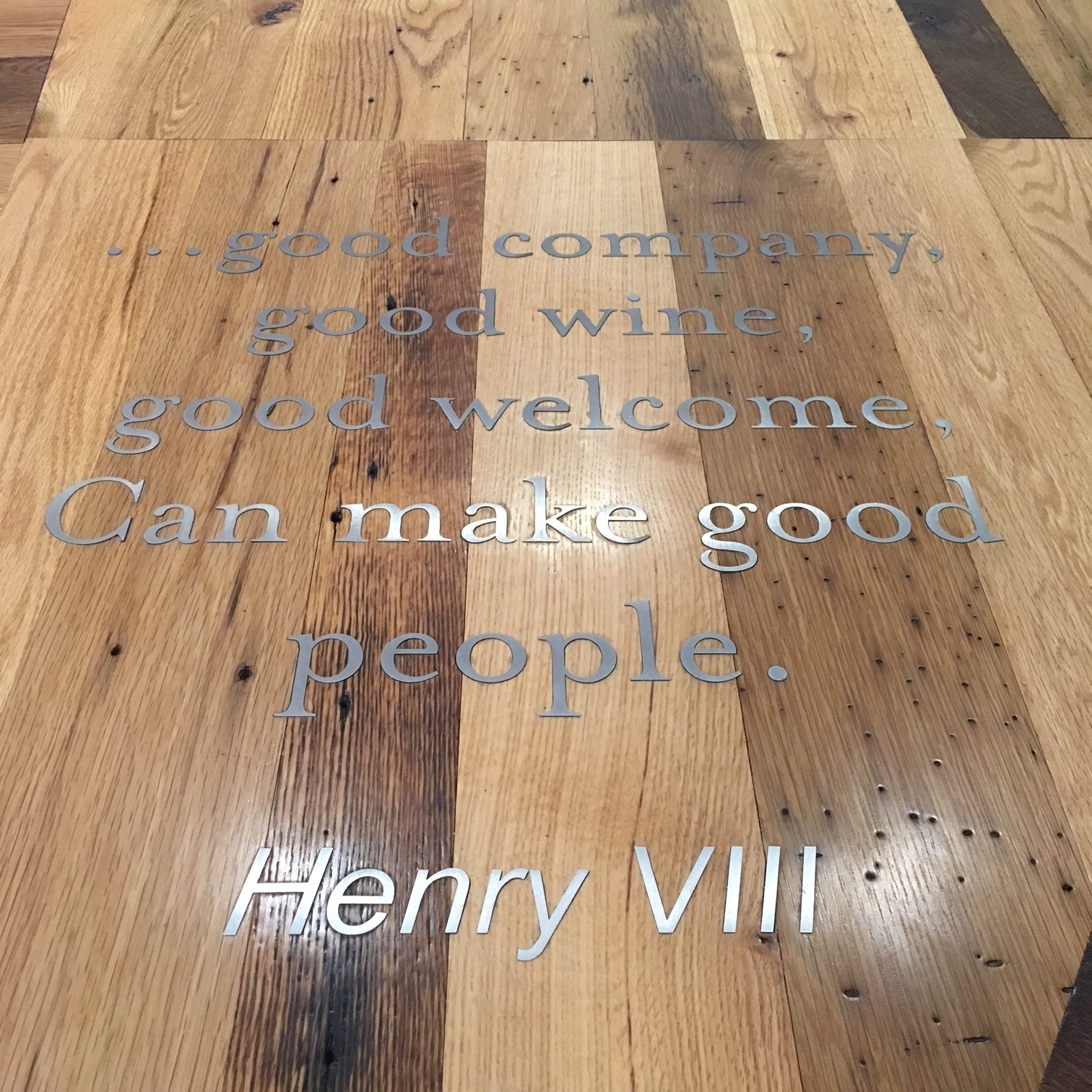
Last month, we had the pleasure of joining IIDA CinDay for their Inspire Me Series tour of The Cincinnati Shakespeare Company. Our tour was led by members of the design team from GBBN as well as members of the Cincy Shakes team. Drawing inspiration from and paying homage to historical theatres such as The Globe Theatre, while keeping in mind the needs of today, Cincy Shakes displays a raw but refined attitude toward design and materials.
Last month, we had the pleasure of joining IIDA CinDay for their Inspire Me Series tour of The Cincinnati Shakespeare Company. Our tour was led by members of the design team from GBBN as well as members of the Cincy Shakes team. Drawing inspiration from and paying homage to historical theatres such as The Globe Theatre, while keeping in mind the needs of today, Cincy Shakes displays a raw but refined attitude toward design and materials. The reclaimed barn wood wasn’t added for a “farmhouse feel” but instead draws its inspiration from theatres past, many of which were constructed with found materials and whatever was readily available at the time of construction.
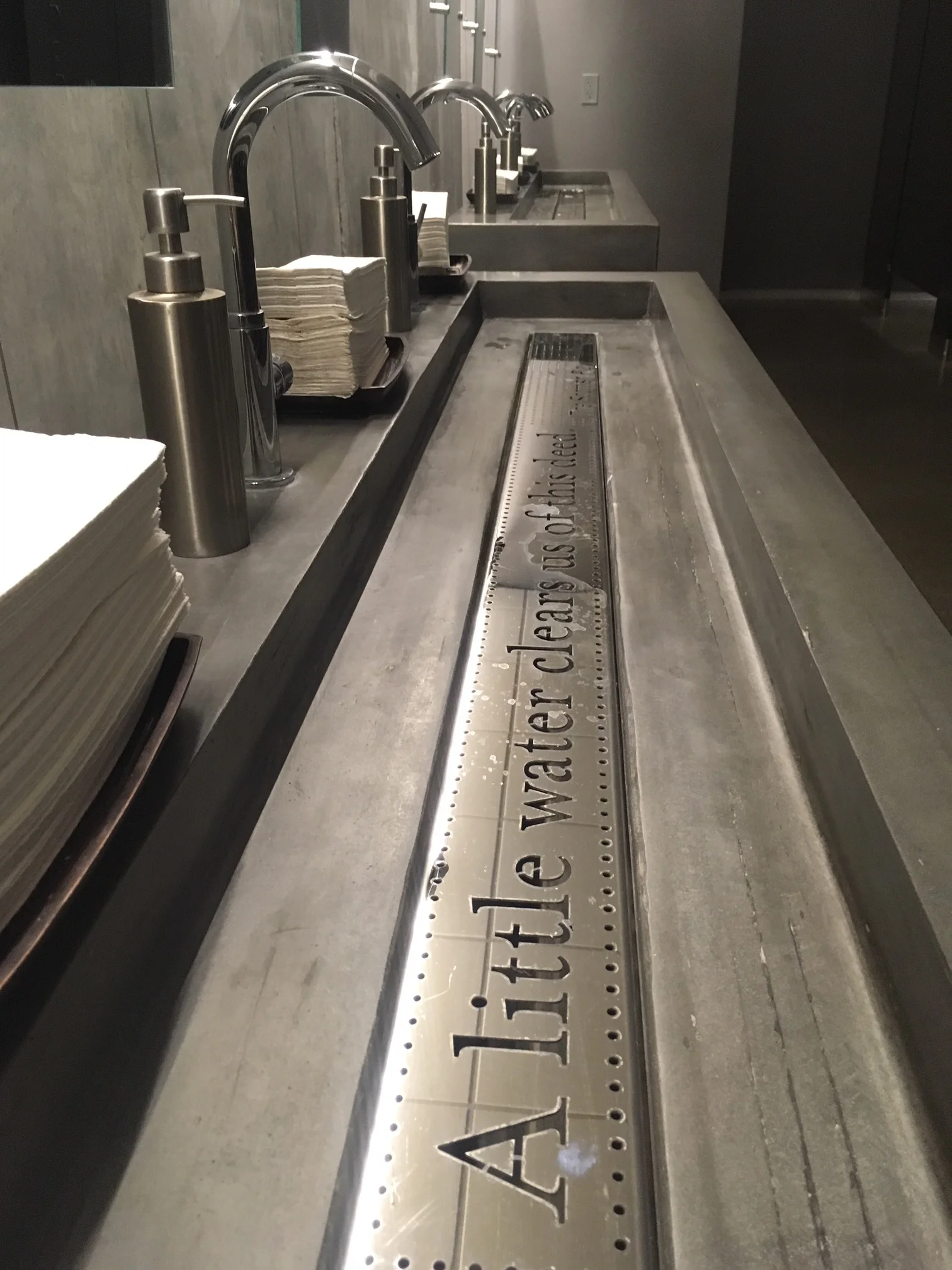
Our favorite design elements within the space were the layers and moments of discovery, when you, as the user, find something when you weren’t expecting to find it. Case in point, an old chandelier used in the new design above the mesh ceiling, or the names of Shakespeare plays in the risers of the main staircase. And let’s not forget about the bathrooms. We definitely judge an overall design based on the design of their bathrooms, and these bathrooms do not disappoint. Keeping scrolling to see some of our favorite photos, and if you haven’t been to Cincy Shakes yet, we highly suggest catching a show there soon!
Exploring Cincy (and The Cov): Workshops at The Frock
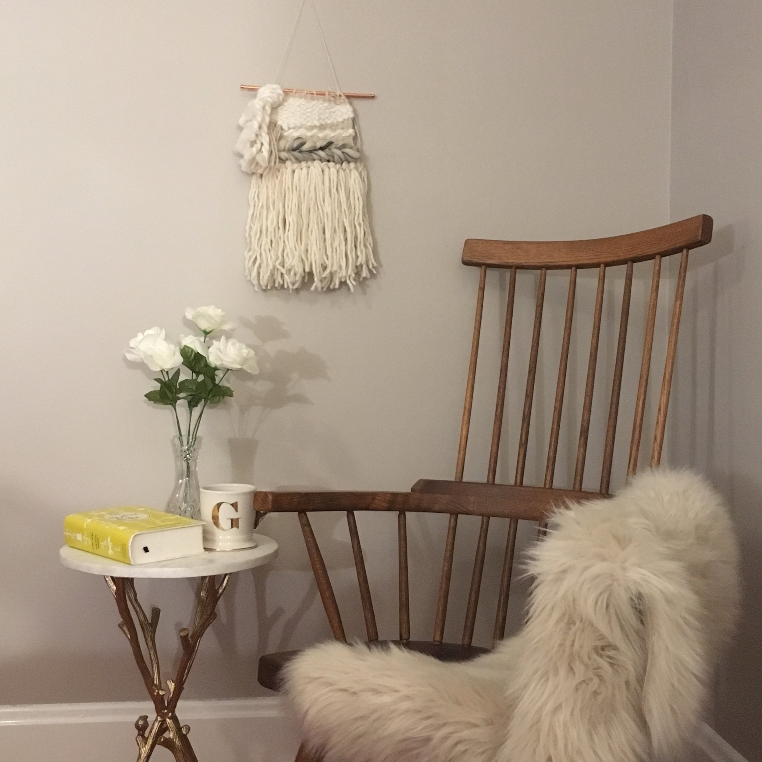
I've always been a big fan of weavings and wall hangings. There are so many droll-inducing designs by artisans who are true masters of this historical craft. Unfortunately, I never had the opportunity to take a weaving class while I was in design school, but when I found out Natalie Kaelin was hosting a class at The Frock in Covington, I jumped at the opportunity.
I've always been a big fan of weavings and wall hangings. There are so many droll-inducing designs by artisans who are true masters of this historical craft. Unfortunately, I never had the opportunity to take a weaving class while I was in design school, but when I found out Natalie Kaelin was hosting a class at The Frock in Covington, I jumped at the opportunity. Natalie creates a beautiful collection of home goods, specializing in handwoven textiles, at her Louisville studio, and occasionally teaches these amazing weaving workshops/classes.
The most fun part of the class was seeing what everyone else created in their weavings. We love that each piece was created by hand and has a unique story to tell. These stories allow people to connect to their space and to one another.
Be sure to check out some of Natalie's work on instagram @nataliekaelinhome or www.nataliekaelin.com and keep scrolling to see some progress and final shots of our weaving.
In case you were wondering, that's Harper. She enjoys getting her photo taken.
It's about farming, not hunting
Plant your seeds. Get to know people. Nurture your crops. Establish quality relationships over quantity relationships. “If your network is a mile wide and an inch deep, it will never be successful” (Misner). Aim for a rich harvest, not a quick kill.
Networking & Relationships: it was the topic at our monthly Rising Tide meeting today, and it's also the central concept surrounding BNI, another networking group we are proud members of.
So why are we talking about farming and hunting? Well, we have a lot to learn from history, anthropology, and our neighbors, especially when it comes to building relationships and building a business.
Let’s start from the beginning: hunting & gathering. Why did it work? Tools for hunting and gathering were easily constructed, requiring little effort and the “cost” was relatively small. With a small population, it’s the best return on investment for obtaining food. That is, until the population grows and local resources begin to be depleted. This causes them to travel further to obtain food, requiring more time and more effort. The result? A lower return on investment. Enter agriculture and farming.
Agriculture and farming require more effort and time to establish, but once the system is up and running, it requires less effort to maintain and expand as the population and need increases.
So what does all this have to do with growing a business? It takes effort and time to establish both your business and your network. The goal isn’t an instantaneous payoff, like the hunter. The goal is to establish something with longevity; something with purpose that can grow and be fruitful.
Plant your seeds. Get to know people. Nurture your crops. Establish quality relationships over quantity relationships. “If your network is a mile wide and an inch deep, it will never be successful” (Misner). Aim for a rich harvest, not a quick kill.
An Investment in Design
A well-designed office environment is not only an investment in the people who work there, but also an investment in their clients and their potential clients
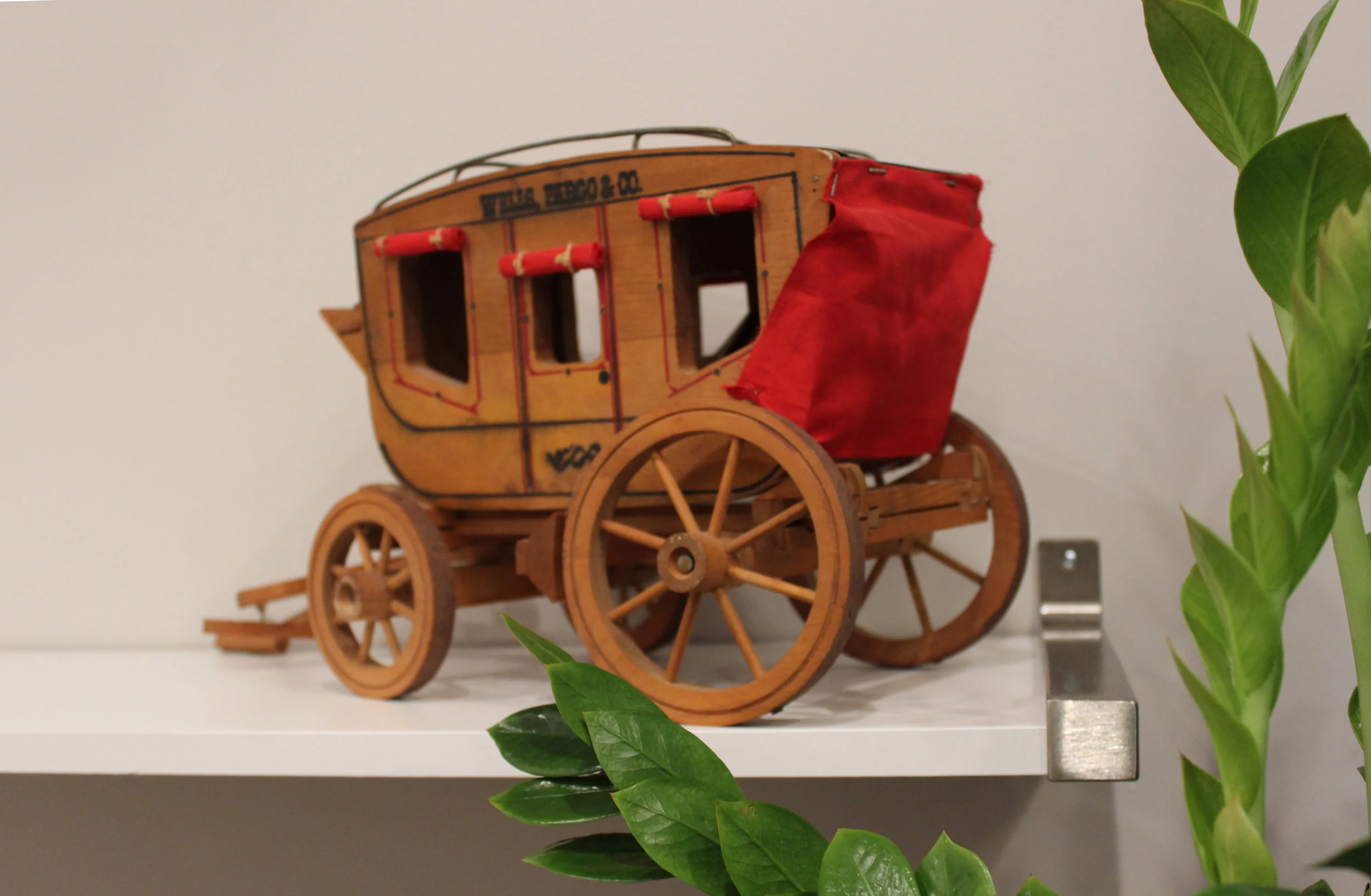
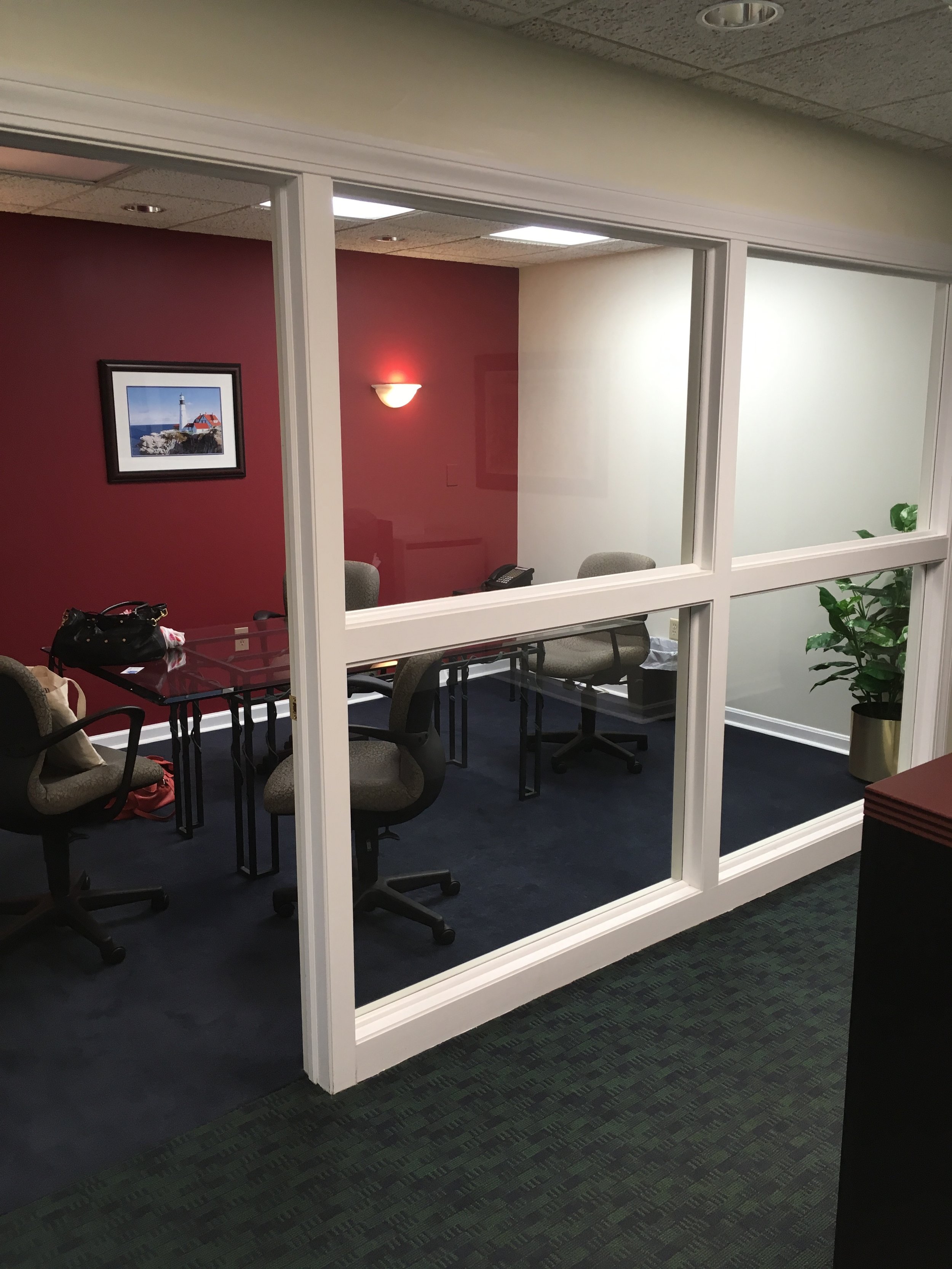
O-ho the Wells Fargo Wagon is a-comin' down the street.. // Details from the financial office's conference room
A well-designed office environment is not only an investment in the people who work there, but also an investment in their clients and their potential clients. A group of financial advisors in Anderson, Ohio wanted to update their office space to create a warm and inviting but professional experience for their customers. Working within the existing floor plan, we focused on the entry, the reception desk, and the conference room, to create updated, functional spaces.
In the entryway, a vintage, Drexel buffet with a leathered granite top acts as a snack and beverage station for employees and clients. Above the buffet, vintage financial ads add visual interest, stick to the brand, but aren’t too overpowering for the space.
Vintage advertisements add graphic elements to the space while staying on brand.
In the conference room, design details give depth to the overall neutral palette. Menswear inspired finishes—a dark conference table, burnt orange chairs with stitching details—and warm elements, such as the aesthetically, functionally, and sustainably carpet tile allow the office to be simple and sophisticated without compromising on style. The original artwork on the wall, “Bull vs. Bear,” provides an additional branded element in the space, speaking to the dichotomy of the global economy.
BEFORE: view into the conference room.
AFTER: A view into the conference room from the reception desk.
Close up of the "Bull vs. Bear" painting.
View from the conference room looking out into the reception area.
Another view from the conference room, looking out into the reception area.
We loved updating this financial office and are incredibly thankful to the group of financial advisors for trusting us to redesign their space.
Hope you enjoyed the photos! Cheers!
Exploring Cincy: Union Terminal
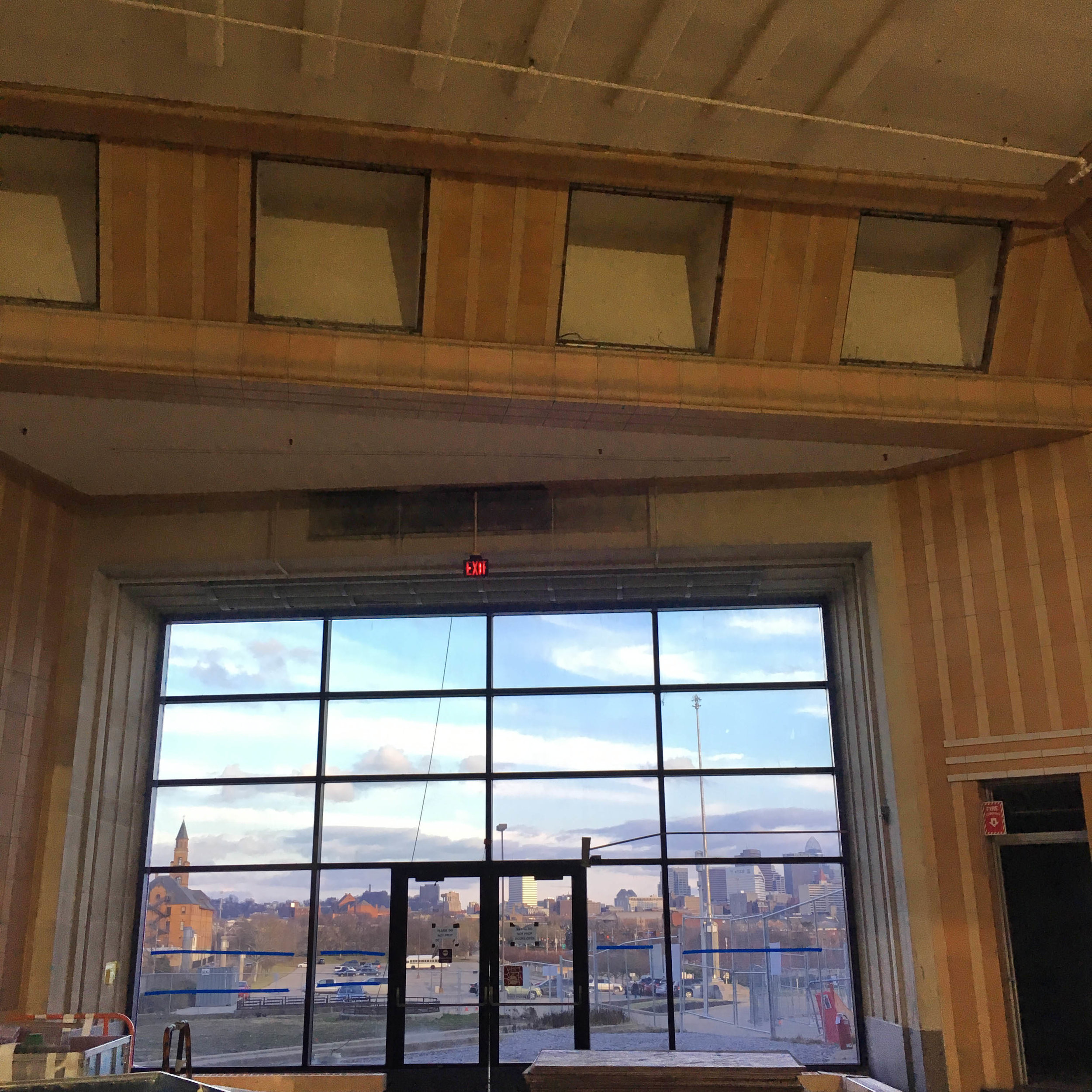
On January 20th, we had the privilege of joining the IIDA-Cincinnati/Dayton chapter for a hardhat tour of the Art Deco beauty, Cincinnati Union Terminal, while it undergoes a massive $217.5 million ($160 million in construction alone) renovation.
Exterior renovation work at Union Terminal. Soon, the fountains will be taken out to repair the building below (which extends out to the oculi) before they are reconstructed.
On January 20th, we had the privilege of joining the IIDA-Cincinnati/Dayton chapter for a hardhat tour of the Art Deco beauty, Cincinnati Union Terminal, while it undergoes a massive $217.5 million ($160 million in construction alone) renovation.
For those of you not familiar with this Cincy icon, the massive building took 3 1/2 years to complete--from August 1929 to March 1933. The cost? $41 million. In today's world, that equates to a whopping $575-$589 million! The impressive scale of this building along with its attention to details are what makes this such an icon in our city. To learn more about the building, head over to http://www.cincymuseum.org/union-terminal
Check our some of our behind the scenes photos below:
Bottom of the seats in the newsreel theatre, where passengers would come to catch the news while waiting for their trains. Why is the bottom of the seat so interesting? This wire mechanism was used to hold passengers' hats while they waited.
The old lunch room at Union Terminal. The new design and renovation will be based on the original design. Small changes here are all new paint colors and new bulbs in the original fixtures (shown hanging above). Larger changes occur on the walls and floor. Along the left wall, where you see the lovely shade of green and tan, there used to be windows! Those windows will be reconstructed and placed. For the floor, new terrazzo will be installed and it will also outline the shape of the original U-shaped lunch counters.
Deco details. We love the attention to detail and materiality in Art Deco designs. Who knew vent covers could ever look so good?
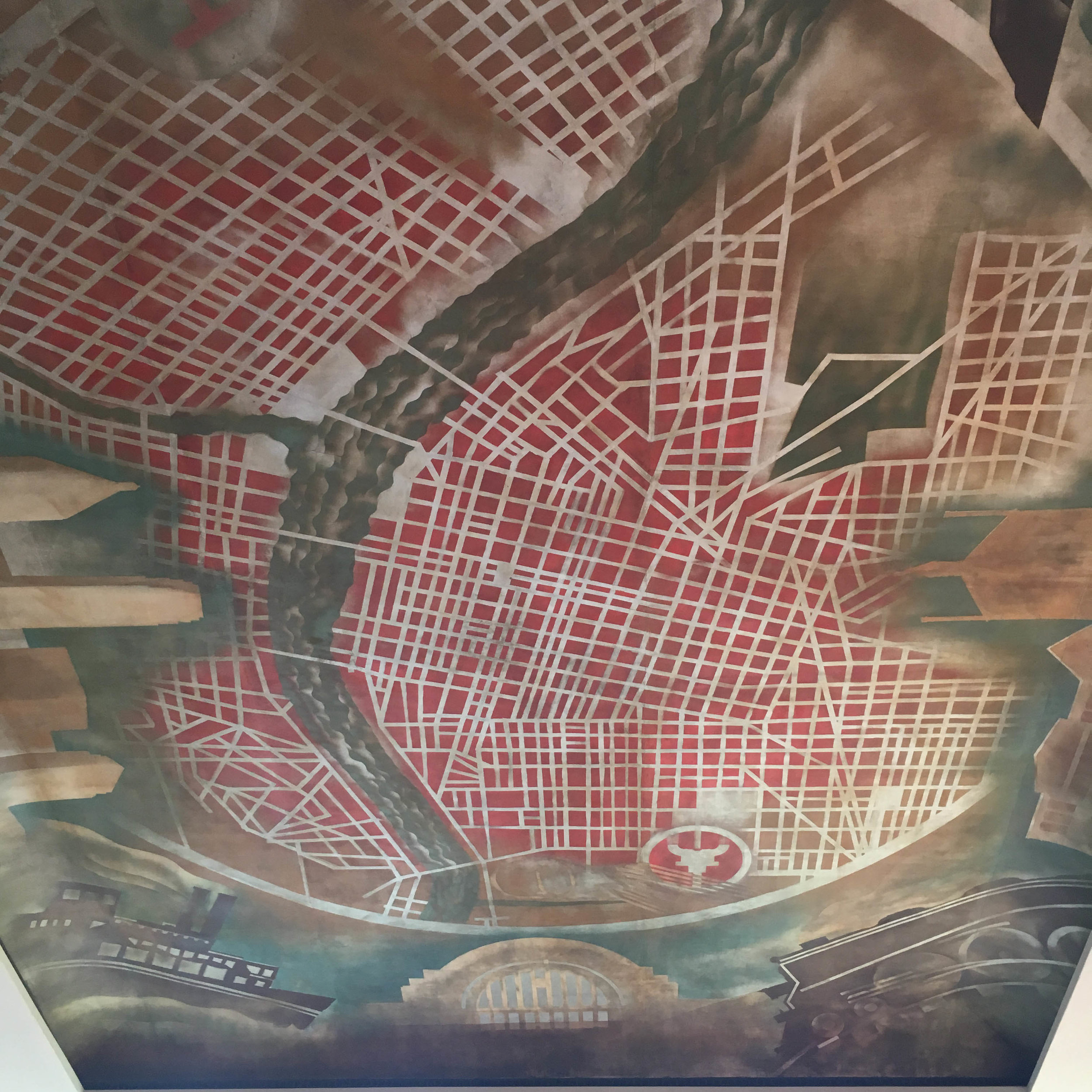
A map of Cincy.. on the ceiling. Not only was the scale of this fresco impressive, but also the vivid colors. There's always red in Cincy.
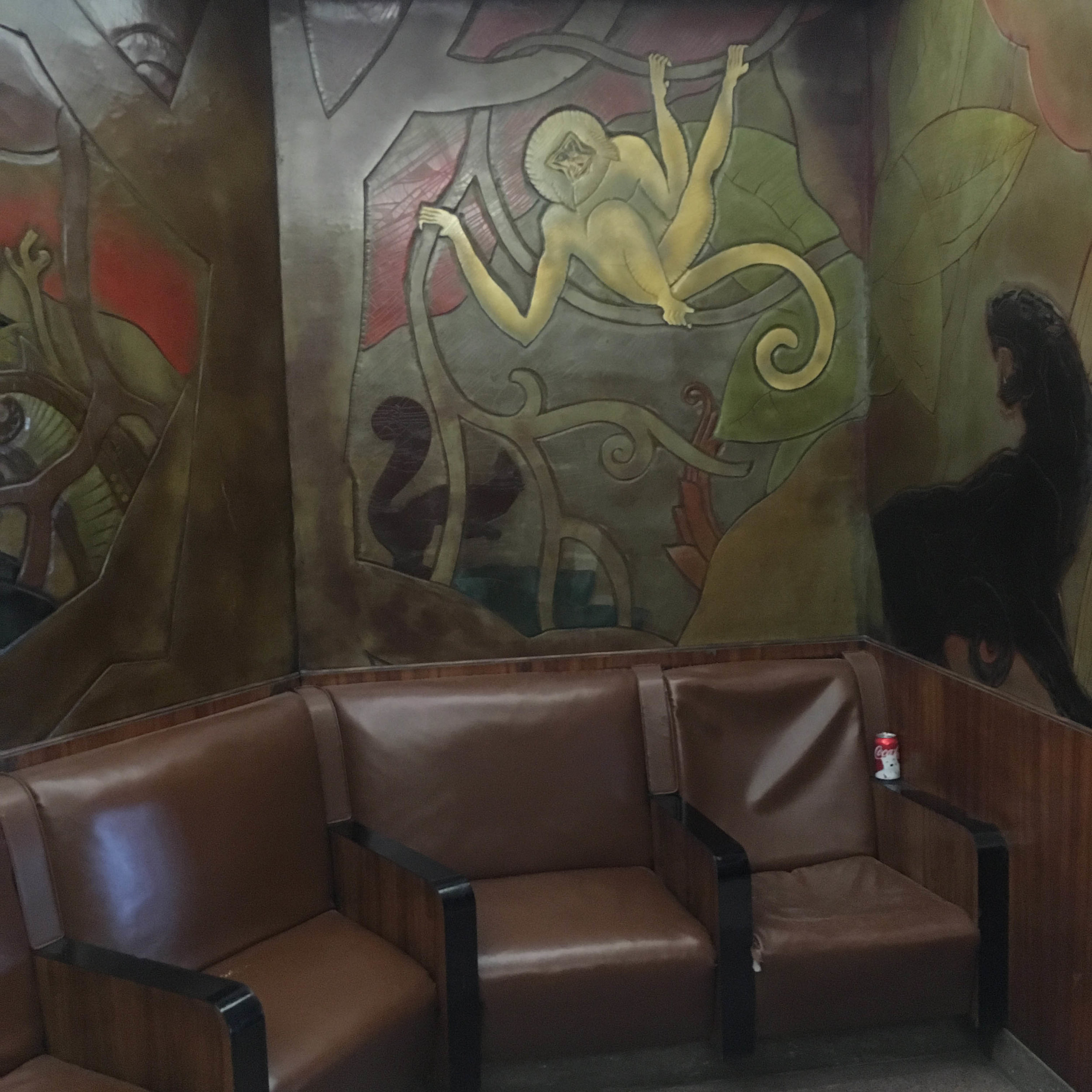
This wall was found in a vestibule area outside a restroom. Again, those deco details, making even the simplest of waiting areas a little more exciting.
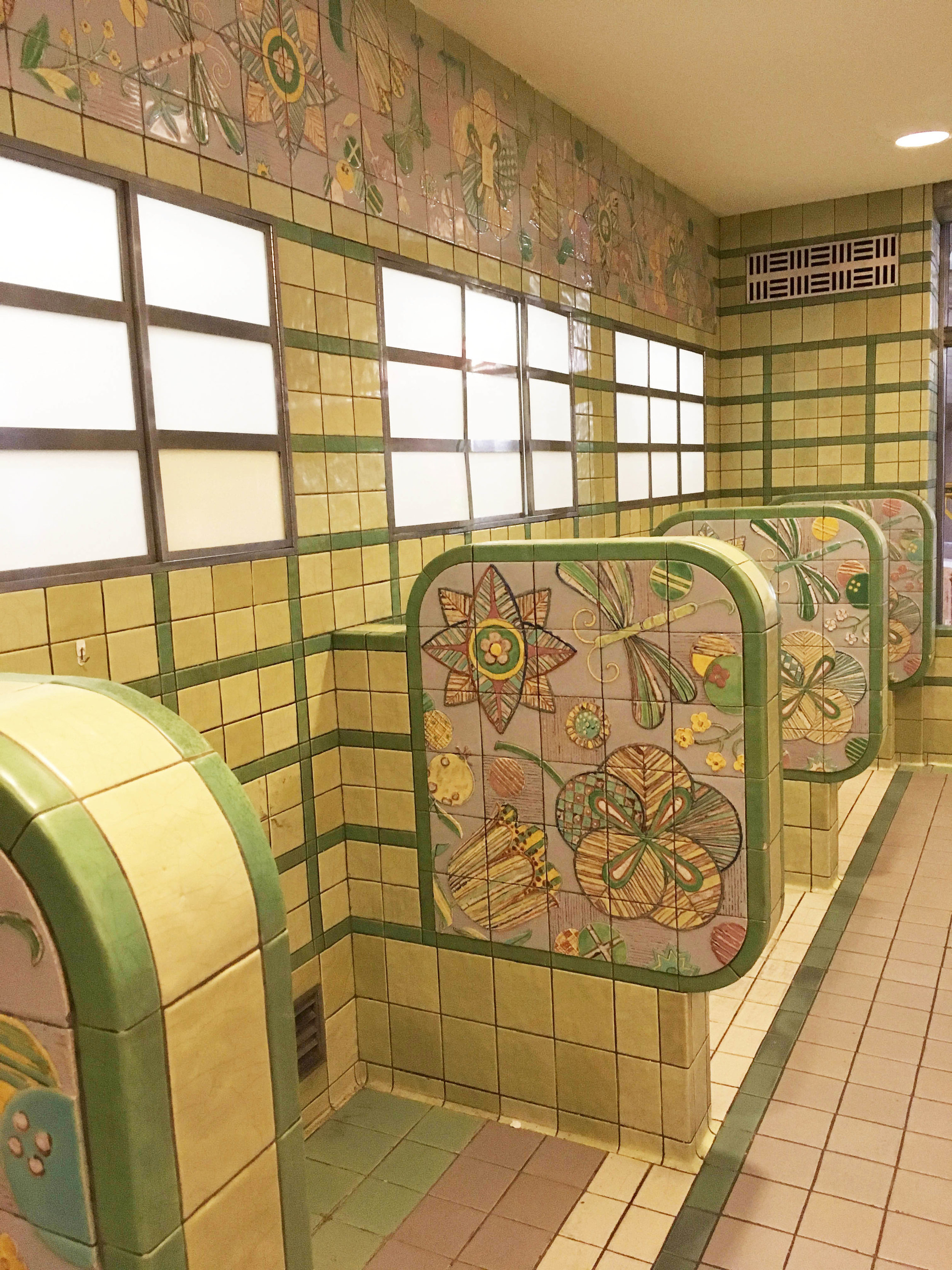
Union Terminal boasts an impressive amount of original Rookwood tile. Most people know this as the ice cream shop, but it was originally a tea room for the passengers. We love the bright colors and motifs in these tiles.
Rookwood tile detail from the tea room.
Since all the exhibits (about 90% anyway) have been removed for the renovation, it's a lot easier to understand the original functionality of the space. There were three vehicle entrances that dropped off (and subsequently picked up) passengers: the left (shown here) was used by taxi cabs; the middle was used by buses; and the right was used by trolleys. Vehicles would drop off their passengers, who would then walk up the sloped ramp to the main concourse. Vehicles would then proceed along the route, underneath the main concourse and exit on the south side of the building. The museum was previously split up into two large exhibit areas, one on the north side and one on the south side. Since the exhibits have been removed, we were able to walk this path, which greatly helped our understanding of the functionality of the building.
The view into the city from the south entrance of Union Terminal.
A map of the United States in the President's office. Each state was constructed from a wood indigenous to that state.
Another detailed design in the President's office. This design of Union Terminal in wood was truly beautiful.
A detail that speaks to the times. In the board room outside the President's office, these chairs boast a built-in cigarette holder and ash tray that flips and dumps the ashes into a cavity beneath.
Keeper of the keys. This key wall is just outside the President's office. The wall design also adds another layer of design and texture to the space.
We hope you enjoyed our photos of Union Terminal! It's truly an iconic building, not just to Cincinnati but to the larger world of architecture. We highly recommend getting a hard hat tour while it's under renovation and then visiting again once all the work is complete.
Cheers! xx
The "sweetest" Bat Mitzvah invitations
Overall showing the candy and sweets icon motif, fun colors, and bold fonts.
One of our favorite projects thus far has been these "sweet" Bat Mitzvah invitations. It's not every day that you get to design for a 13 year old, but when you do, you can use fun colors, graphic motifs, and bold fonts.
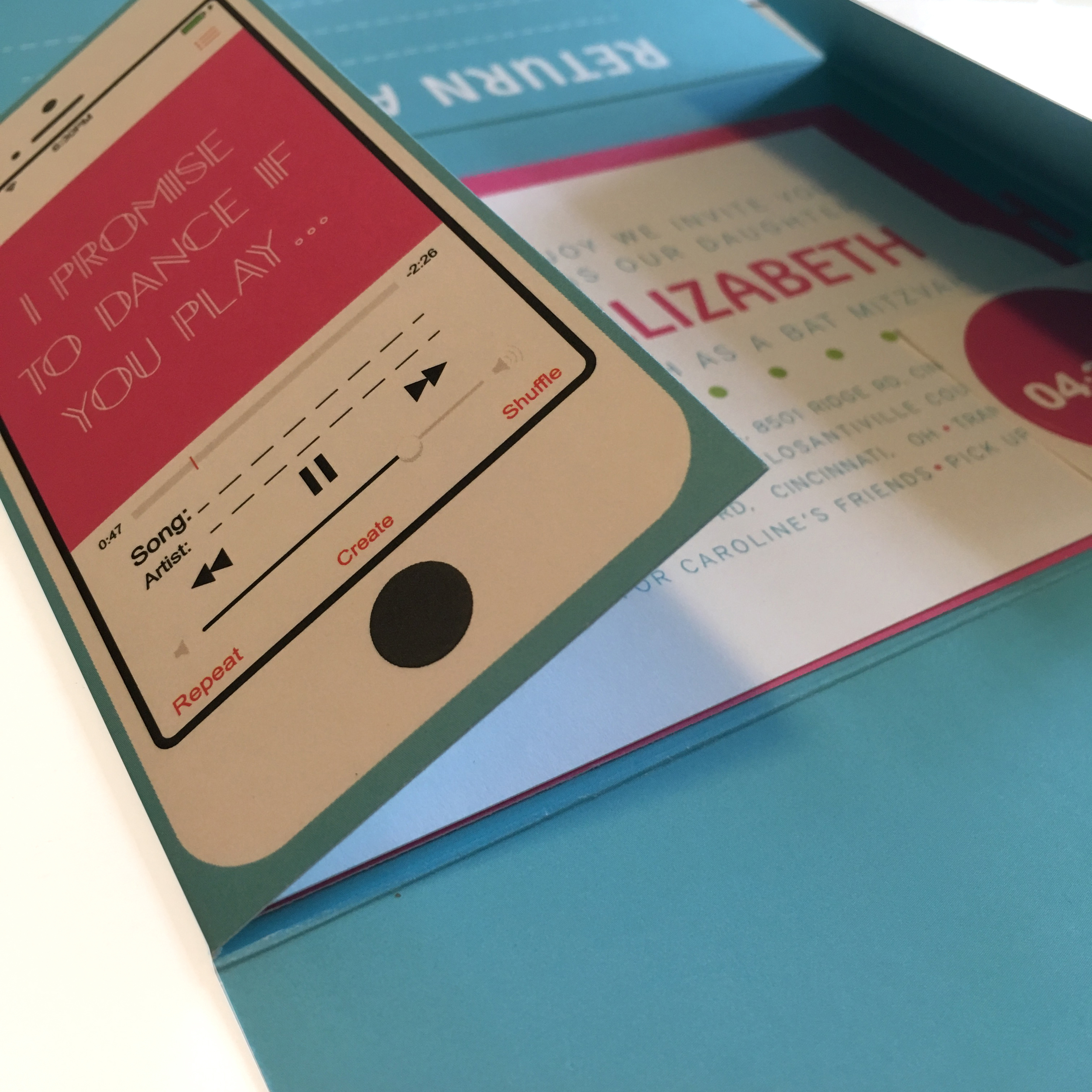
Focusing on simplistic and bold design, the Bat Mitzvah invitation package challenges the notion of traditional invitation packaging. The outside "envelope" unfolds, revealing two invitations; then flips over and shows the RSVP information.
With a non-traditional envelope, you have non-traditional how to's
While opening the invitation, one notices the song request on the reverse side of the "envelope."
The back of the "envelope" is also branded, showing the candy motif as well as the lollipop "i" in Caroline's name. The "envelope" opens to show the main ceremony invite.
The party invitation expands on the candy motif, shown here in various colors and applications.
The "envelope" flipped over to show the RSVP info on the left and a song request on the right.
The guest then fills out the RSVP information, refolds the "envelope," places a sticker on the back, fills in their address, and sends it back in the mail.
The bold typeface of the date became a reoccurring motif in the invitation package.
Return address showing the lollipop "i" in Caroline's name.
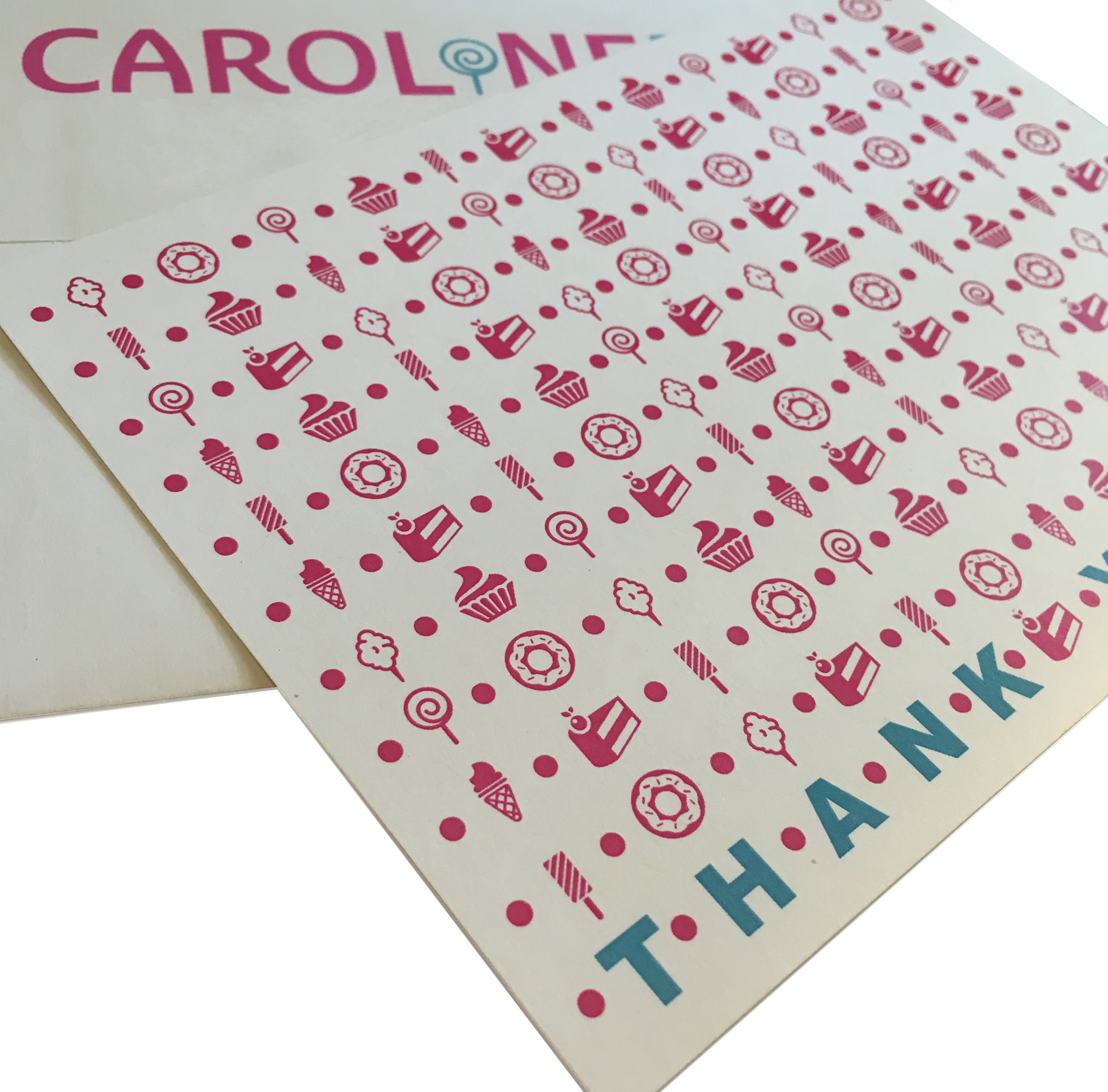
The bold color palette and simple typefaces keep a fun, consistent, graphic presentation all the way to thank you notes.
Custom thank you notes with the candy motif.
The candy and sweets icon motif, the lollipop "i," and the fun colors all reinforce the Bat Mitzvah's theme, "Sweet Caroline." This was one of our favorite projects to date, and we cannot wait to design more.
Exploring Cincy: Art Deco on Dalton Ave
What I like most about cities is their depth. The ability to always find something “new,” even if new means you’ve seen it from the highway 100 times, driven down its road 12 times, and the structure itself has stood for 84 years.
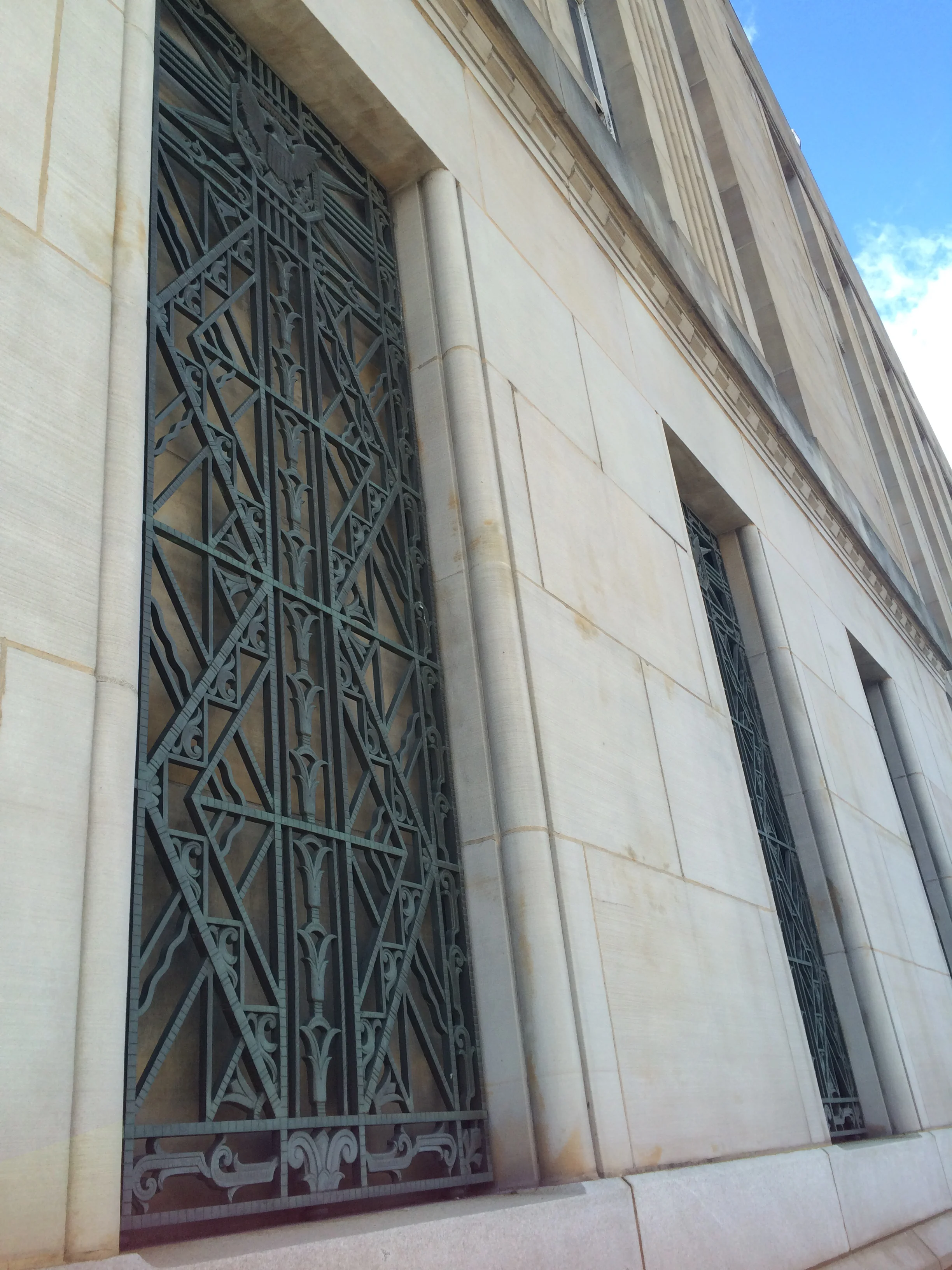
Sandstone and granite walls are accented by decorative bars on the windows.
What I like most about cities is their depth. The ability to always find something “new,” even if new means you’ve seen it from the highway 100 times, driven down its road 12 times, and the structure itself has stood for 84 years.
Last week, while investigating a gaffe with the post office, we were prompted to visit the downtown location. After a quick Google search to find the address, I noticed that the post office had 4.5 stars on Yelp. 4.5 stars on Yelp?!? I thought…How in the world?! I will make the assumption that most of you have visited more than one post office in recent history. If that is the case, I will assume again that you might not give your post office 4 or 5 stars. I was intrigued. Then I saw the photos on yelp. Okay Brittany. We HAVE to go. So we did.
Walking up from the parking lot, I was in awe. Smooth, simple walls made of sandstone and granite accented by decorative bars on the windows; everything about this building is quintessentially Art Deco. A stepped back entry with large bronze doors, a geometric, bronze detail above, and an ornate relief give you a taste of the Deco details inside.
Deco details welcome you into the space.
I walked in, and I swear my jaw dropped. This is a POST OFFICE?! I thought. It was beautiful. A bronze plaque adjacent to the vestibule confirmed its Art Deco roots: “This building was erected under the administration of Herbert Hoover…1932.” It also listed the architect, Samuel Hannaford & Sons.
The vestibule
For you Cincy aficionados, that name should be familiar. Hannaford & Sons designed many prominent structures. Some of the most notable include The Cincinnatian Hotel (1882), City Hall (1893), Music Hall (1896), Emery Theatre (1912), and the Cincinnati Times-Star Building (1933) (SPMH).
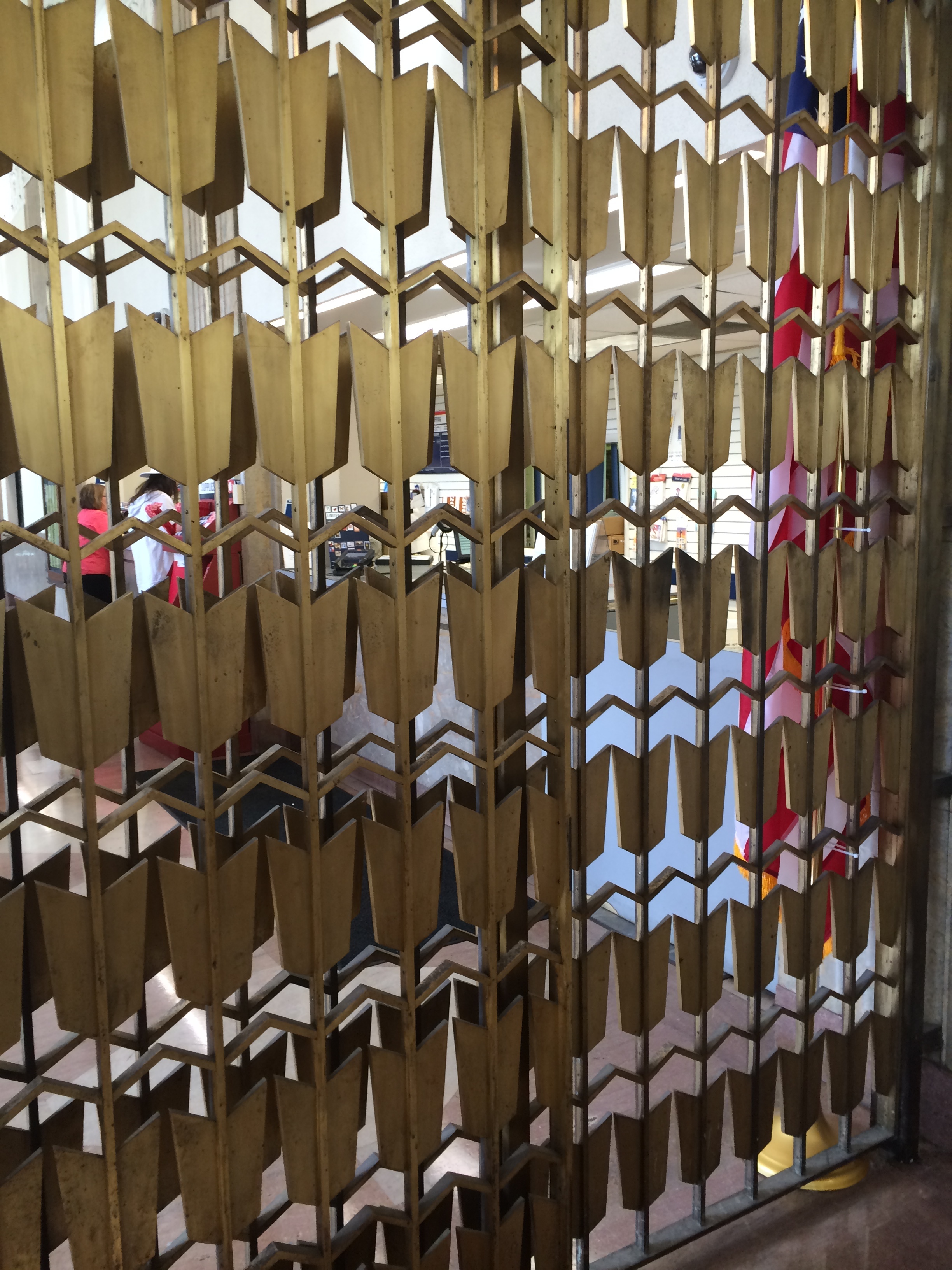
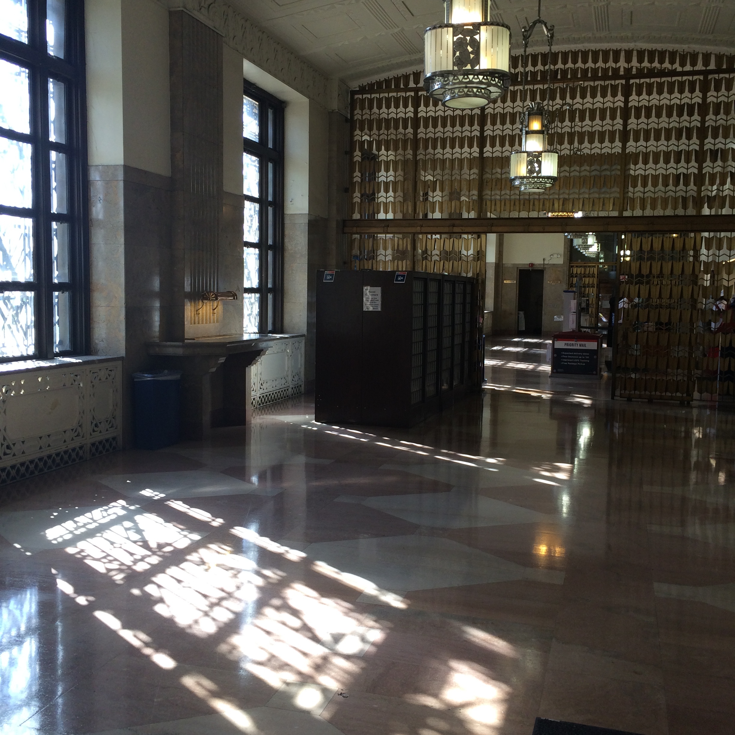
On the way to the transaction counter, we found more Deco details. Marble inlay floors, built-in marble counters with task lighting for addressing, floral reliefs on the ceiling; the list goes on. One of my favorite design elements was the bronze, geometric partition between the lobby and transaction counter. The geometries it creates are amazing, and I love the patina it has developed over time.
Geometric screen detail
And I can’t complete this post without discussing the lighting in this building. Holy smokes. The reflections and shadows created from sunlight peering in through the ornate bars on the windows are simply stunning. The pictures attempt to do it justice, but you really need to see it in person.
Next time you’ve got something to mail and have an extra 20 minutes, I highly recommend checking out the Dalton Ave Post Office. It’s a beautiful Cincy gem and did I mention how nice the postal workers there are?!
Cheers x
Allison
Works Cited
The Society for the Preservation of Music Hall (SPMH). Samuel Hannaford. March 2016.
How I Got Here, Part 1
As they say, do it with passion or not at all. Here’s to a new beginning...cheers!
I was never one of those people that said, “Since age 8, I knew I wanted to be a designer.” First of all, I grew up in the middle of nowhere, surrounded by cornfields. Urbana is a great Midwestern town, but there wasn’t exactly a gigantic design influence in the contemporary sense. Second, I was too concerned about the now: four square at recess; soccer practice in the evening; that times table test is coming up next week and I had to get all of them right (missing one was not an option).
As time went on, I found myself a jack-of-all-trades but a master-of-none. I loved reading and writing but I enjoyed chemistry, too. I got straight As in math and calculus, but the art room was my safe haven. The cavernous room, led by a teacher that forever changed the way I thought, designed, and existed, was a place I could go and be whoever I wanted to be. Or maybe I was trying to become the person I already was. Maybe that should have been enough of a sign to push me in the creative/design direction but it wasn’t.
I graduated high school at the top of my class, and everyone oohed and aahed at me majoring in Mechanical Engineering, wanting to design roller coasters. Everything seemed to be lining up just how it should; I would be smart and successful. What else would I need? Despite studying all day and night and getting good grades in engineering, I felt like something was missing. I found myself staying in on Saturday nights to make collages, art projects, or just simply draw. I eventually had a come-to-Jesus moment and decided to make a change.
I needed creativity. I needed something that could challenge me differently. Engineering was challenging, don’t get me wrong, but once you arrived at an answer, that was it. I learned the process to arrive at an answer, and once I got there, I felt unfulfilled. I wanted something that kept pushing me and challenging me past conventional answers. After crying to my parents and others, and talking to several high school teachers and mentors, I made the decision to enter DAAP as an Interior Design major.
It was not easy. Nothing about design school is easy. It was often painfully difficult, especially with the lack of sleep. But it was challenging. And if that’s what I wanted, I got it. Throughout design school, I questioned if I was in the right place. I hadn’t really loved any of my internships, and I was questioning what it would be like in the real world. I graduated, without any job offers in my field, and then was thrust into the real world.
For the next couple years, I continued to question what I was doing and where I was going. I knew what I enjoyed—branding, graphics, furniture, antiques and vintage finds—and I knew what I didn’t—being a slave to the computer, exhausted ideas.
One day last fall, my mom brought me several (okay, a lot) of boxes from my childhood. Boxes filled with old sports trophies, drawings from elementary school, and all my old journals. I eventually came across my box from “E.L.” Short for “Exceptional Learners,” EL was a cherished part of every week, where a small group of us had a day outside of our traditional classroom and had learning modules based upon Bloom’s Taxonomy. At the beginning of each year, we had to fill out a “Personality Profile” asking us questions like, “The title of a book a bout me would be..” or “If I could be any age, I would like to be __ because..”
I eventually came across my profile from when I was in 6th grade, age 11. It had an interesting question with a more interesting answer. Question: “In 20 years, I…” My answer: “In 20 years, I will be designing clothes or buildings.”
In 20 years..
There were many emotions in that moment. The first, astonishment. I did not at all remember that question nor that answer. My 11 year old self knew who I was and what I wanted, but it sure took me a long time to listen to her. In that moment, I realized that I was right where I needed to be.
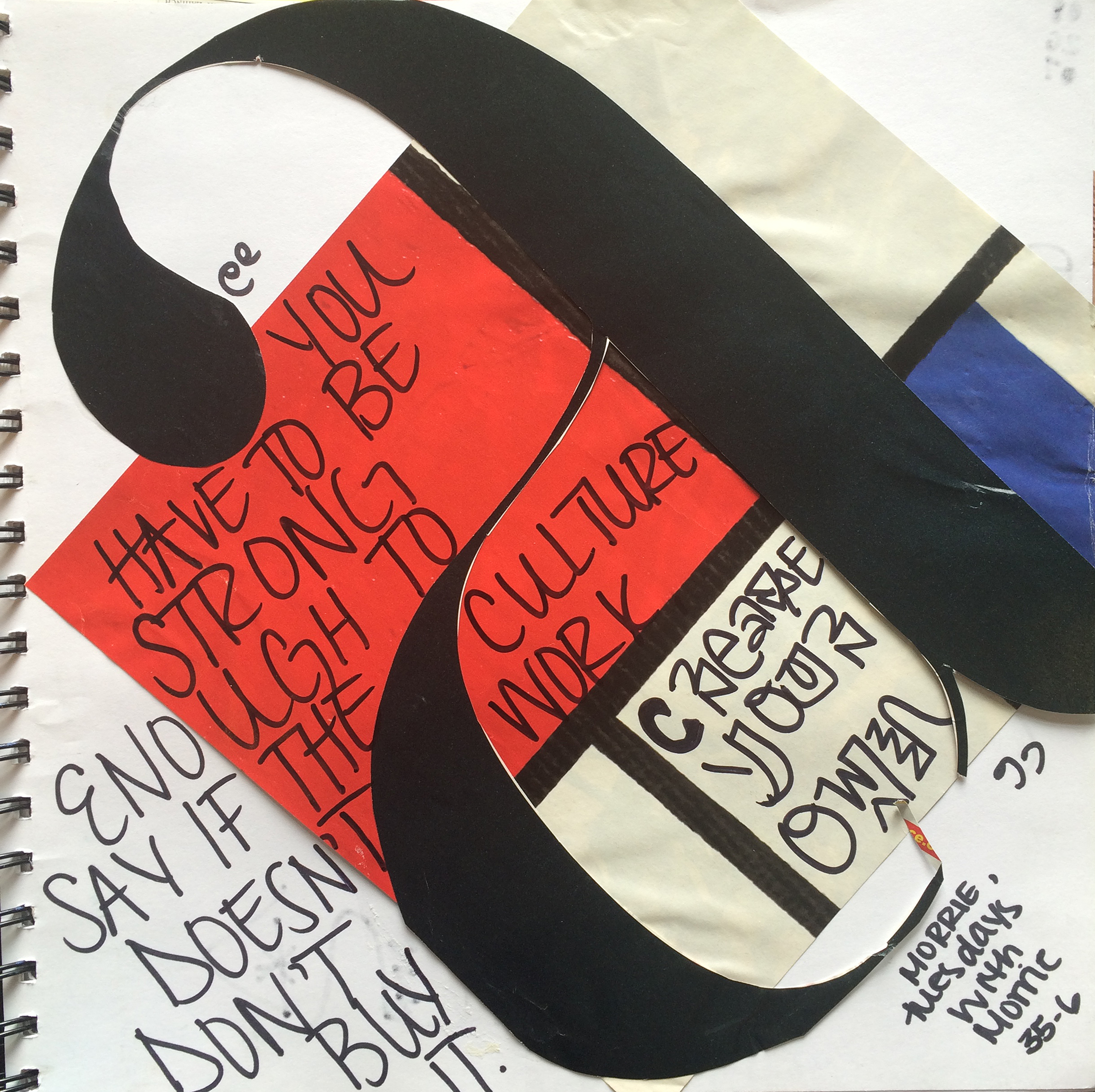
Shortly after, I started digging through my old journals, also known as a whirlwind of teenage emotions. I did many collages in these journals, and I came across one, a passage from “Tuesdays with Morrie,” one of my favorite books we read in high school: “You have to be strong enough to say if the culture doesn’t work, don’t buy it. Create your own.” The timing could not have been more perfect.
“You have to be strong enough to say if the culture doesn’t work, don’t buy it. Create your own.” (Tuesdays with Morrie)
It’s definitely been a non-linear path to get here, but I could not be more excited to start this new endeavor. FOUNDRYno.201 is built on passion for design of all types and creativity. For my jack-of-all-trades-master-of-none personality, it’s a perfect fit. As they say, do it with passion or not at all. Here’s to a new beginning...cheers!
Allison
Ps.. stayed tuned for part II with Brittany!


