

Tranquility on Treeknoll
In order to achieve the client wish list of a more functional floor plan and more linear feet of hanging space, the program included four zones: 1. An “open-concept” style closet system with wardrobe cabinetry; 2. A walk-in wet room with freestanding tub and shower; 3. Separate his and hers vanities; 4. A separate toilet room.

Have you ever walked into a space and thought, “This is gigantic! But there’s so much wasted space?” That was our first impression of this master bathroom and closet when we saw it. A large “dressing area” in the middle of the space along with an angled garden tub collectively took up half of the available square footage in the room. A good-sized walk in closet was under-utilized with a minimal organization solution that only occupied two walls.
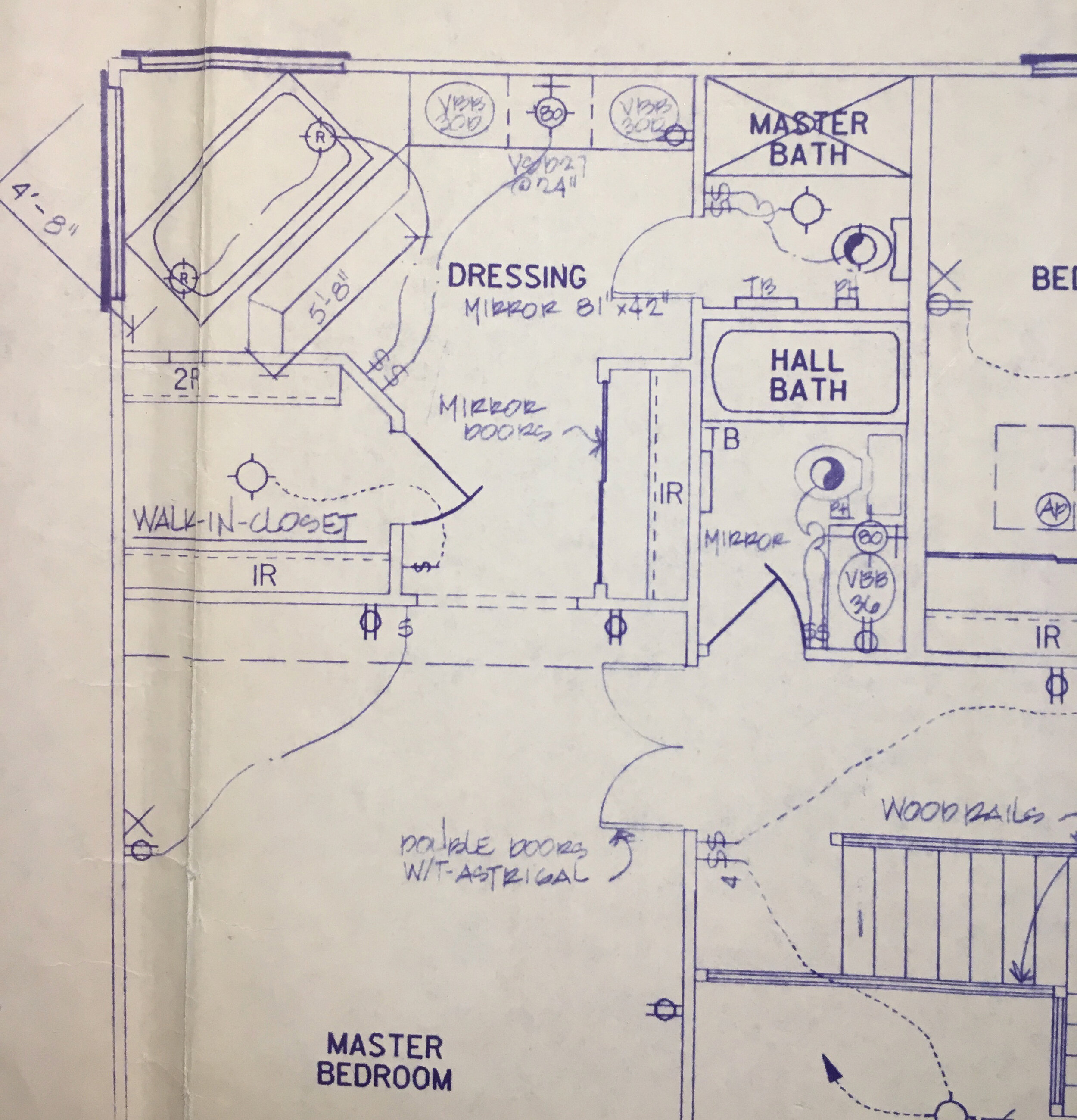
Original blueprints of the master bathroom. The large garden tub and walk-in closet take up almost 1/2 of the entire square footage of the room.

Large garden tub with decking around.

The vanity and “dressing area” on the floor plan.

Another view of the “dressing area” on the floor plan.
In order to achieve the client wish list of a more functional floor plan and more linear feet of hanging space, the program included four zones: 1. An “open-concept” style closet system with wardrobe cabinetry; 2. A walk-in wet room with freestanding tub and shower; 3. Separate his and hers vanities; 4. A separate toilet room.

Rendered floor plan showing our proposed layout.
By proposing an open concept closet system, we gained the space that typically would have to be created to build walls around a walk-in closet in addition to the floor space one would need to be able to walk around in their walk-in closet. In the wet room area, we had plenty of space to add a large freestanding tub in addition to a large shower area. The area is closed off adjacent to the shower head with a clear glass shower enclosure and open on the side toward the closet and hers vanity. Separate his and hers vanities, provide more countertop space for getting ready. By placing her vanity in the middle of the floor plan, we created a natural barrier between the front area of the plan and the rear “wet area” and were able to maximize counter space for both vanities. Each vanity was completely custom, tailored to the needs of each spouse, designed by us and fabricated by Western Custom Cabinetry.
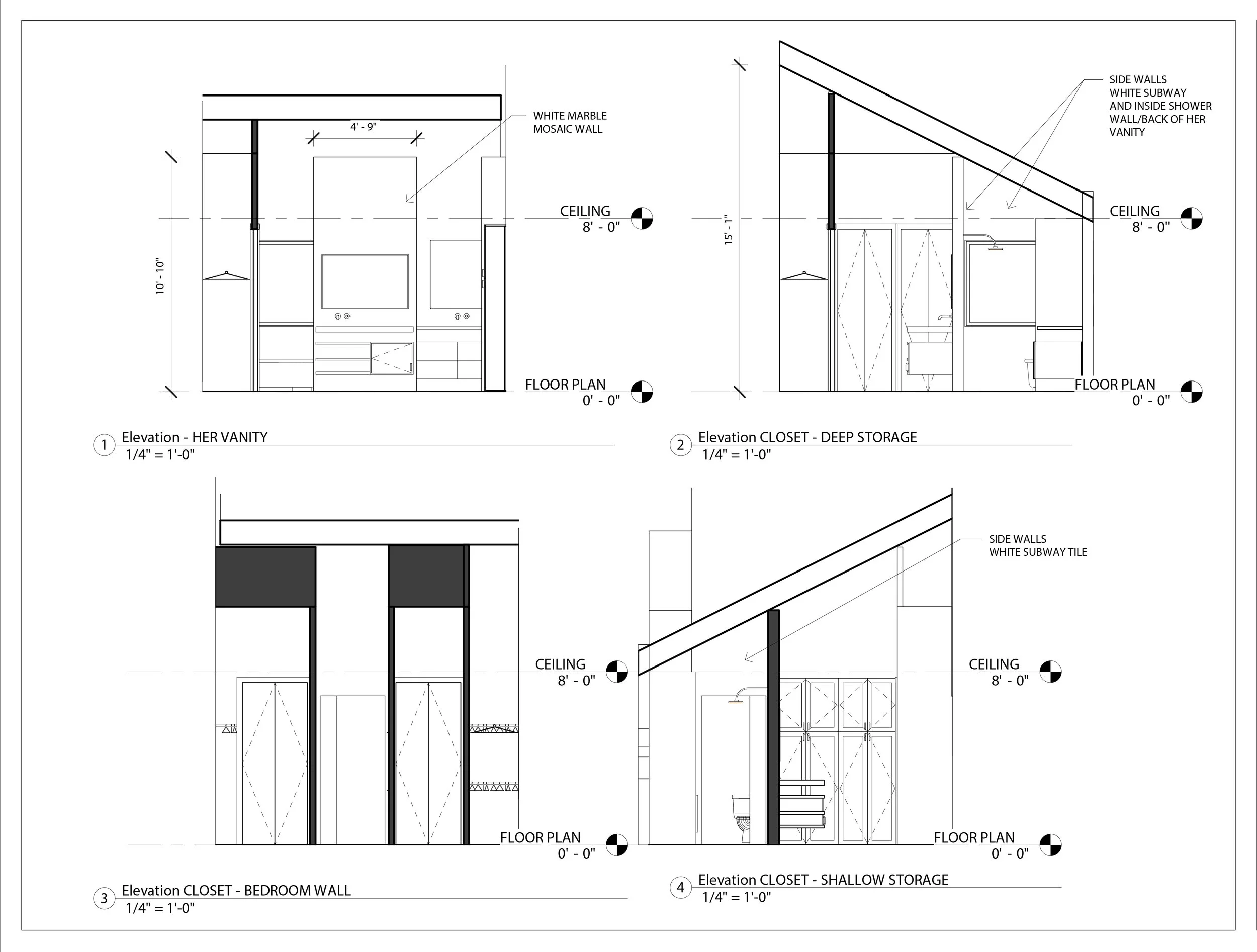
A few elevation drawings for the project.

Demo complete; you can finally see just how much space you have! In this case, a lot!

Framing and pluming going in.

Floor to ceiling tile going in. This nook is where the tub will go.
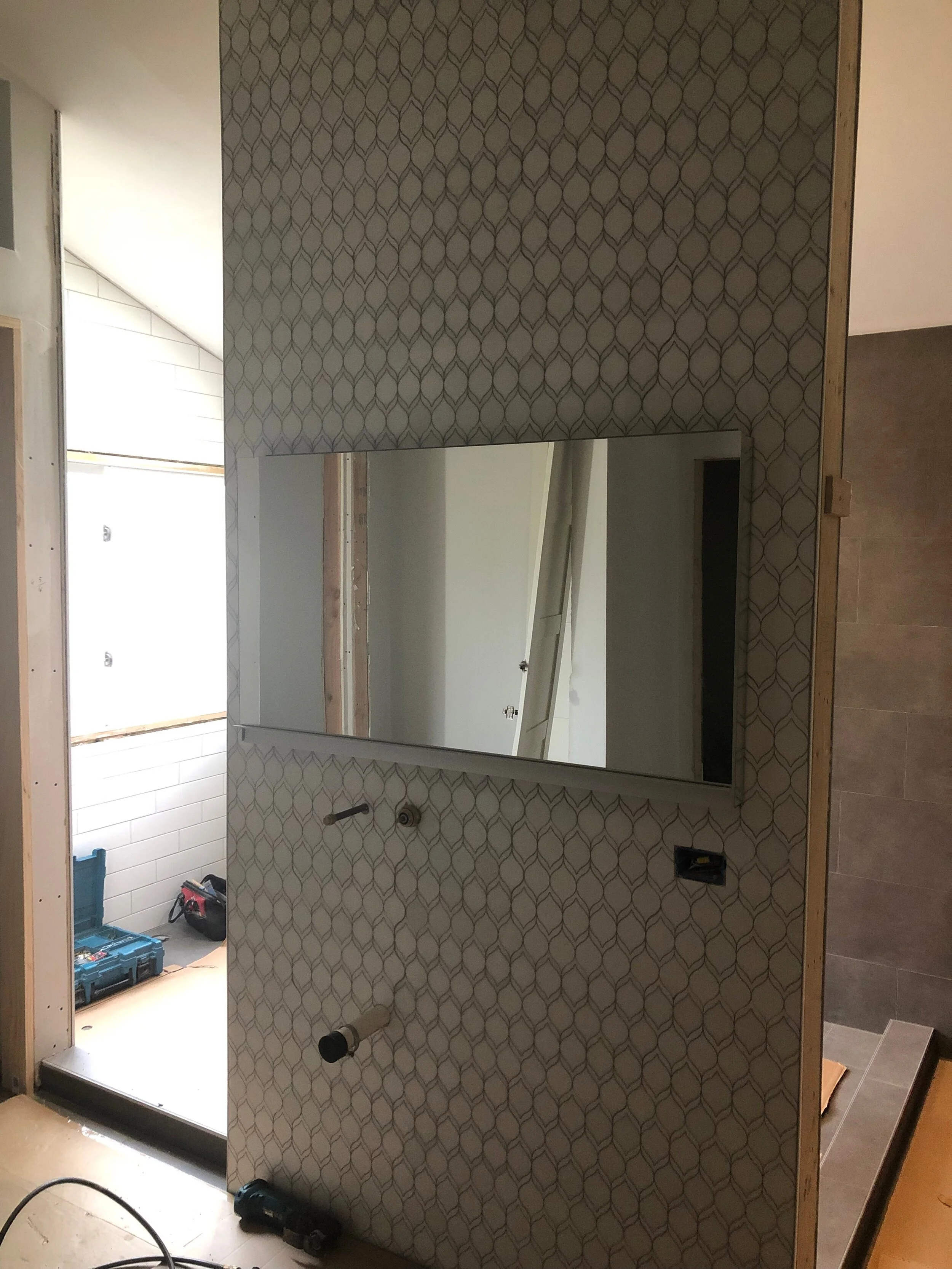
Vanity wall tile. We love the lemon shape of these tiles!

Medicine cabinet from Robern features internal lighting and amazing storage.

Looking from the shower to the “his” vanity. The countertop expends into the void and open shelving above allows for additional storage.
The materials palette in the space is a tranquil mix of neutrals and clean lines, complimenting an architectural lighting package. The “hers” vanity was the perfect location for an accent tile, where we added a white marble decorative tile in a lemon-shape. A cluster of pendants hangs to the right of the hers vanity, while the rest of the lights in the space are either recessed or a simple double ended sconce
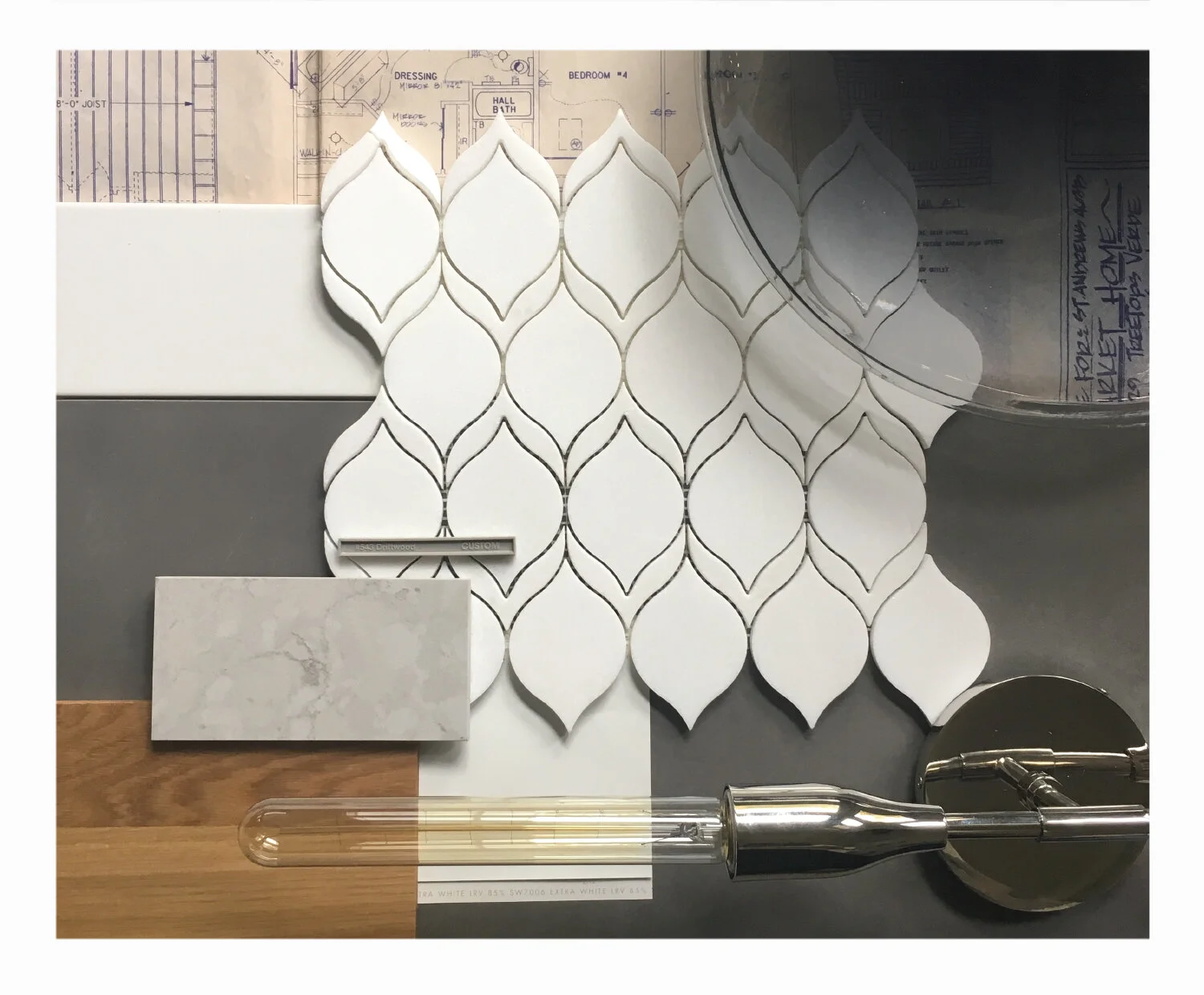
Materials palette for the project.

Her vanity.

His vanity.

Standing at "his” vanity and looking into the wet room.

The open closet system continues around the perimeter of the space.

Because the design provided ample storage space, hidden by the mix of clean lined, neutral materials - this master bath became a calm and organized space to start or end the day. Ah, tranquility.
.

Cramped Kenwood kitchen updated for a young family
The original kitchen in this Kenwood home was a little dark, a little crowded, and a whole lot of not functional for a family of 4. The lack of countertop space was forcing this homeowner to use a moveable butcher block island every evening for prep space, but the lack of space around that prep space was forcing the client to move the island out of the space after prep was done since there wasn’t much space to get around or through.
The original kitchen in this Kenwood home was a little dark, a little crowded, and a whole lot of not functional for a family of 4. The lack of countertop space was forcing this homeowner to use a moveable butcher block island every evening for prep space, but the lack of space around that prep space was forcing the client to move the island out of the space after prep was done since there wasn’t much space to get around or through.

One corner of the kitchen as demo began. The opening to the left of the door is where the homeowner kept their moveable, butcher block island.

The opposite corner of the kitchen as demo began.
The solution was to remove the wall between the existing kitchen and a less-used formal dining room, doubling the footprint of the kitchen. From there, we opened the newly created kitchen to a previous formal living room, creating a comfy, cozy, and open concept on the first floor. To create this almost 18’ opening, we added an LVL for structural support and recessed it as far as we could.

Removing those walls made a HUGE difference! The new footprint of this soon-to-be kitchen is massive.
With the kitchen now open to the front of the house and in the back of the house—wherever you are, you can almost always see the kitchen—we created an L-shaped kitchen to create a good working triangle and vent the cooktop to the exterior. The 10’-6” island creates the perfect prep space or gathering space for kid meals or gathering with friends. Since we had white perimeter cabinets and a navy-gray stain on the island, we added Cambria to both the island and perimeter cabinetry to keep things cohesive.

Countertop install day!
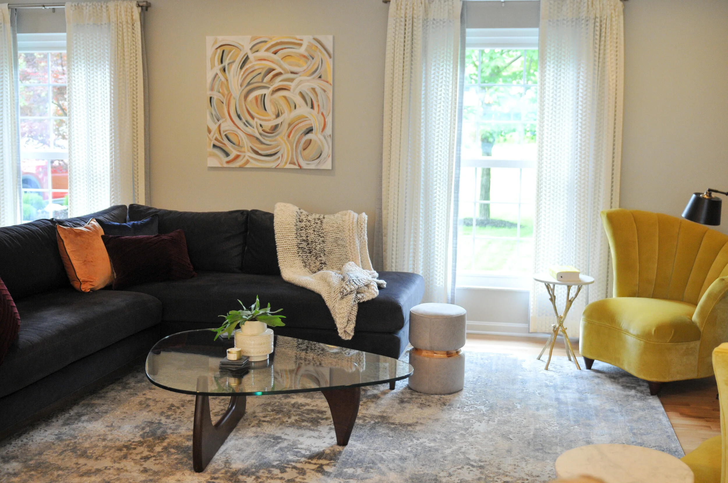
Once the kitchen remodel was winding down, we began to address the front living room. We kept things simple but sophisticated on the large rug (which is almost the inverse of the quartz countertops) and dark sectional. We added pops of interest by reupholstering a set of funky 1980s chairs in a chartreuse velvet and added two layers of graphic sheers on the window treatments for both privacy and fun.
The result is a first floor that feels open and inviting while fulfilling the functional and aesthetics needs of a young family.

Photograph by Brooke Mullins Photography

Photograph by Brooke Mullins Photography

Photograph by Brooke Mullins Photography

Photograph by Brooke Mullins Photography
Photograph by Brooke Mullins Photography

Photograph by Brooke Mullins Photography

We're 3!
We’re 3! Last month we celebrated FOUNDRY’s third business anniversary!
Three years ago, we stepped out on our own, with a vision of creating a studio and culture that reflected who we were and how we wanted to design. From our days at DAAP to days in offices and on construction sites, we had countless experiences that shaped our view on design and its place in the world. We never felt that design was an individual sport, and we also never felt that design (and designers) should create, design, or exist in a vacuum.
Our branding and tagline, “Creativity | Collaboration | Connection,” while seemingly some kind of catchy alliteration, came fairly naturally and fairly quickly. It was born out of the notion that design should inherently be those things; design should be seeing the world as is and imagining it in a new way; design should be a collaborative, “us is more” concept; design should be connective, to a place, to one another, and ultimately bring people together. We felt in our core that these 3Cs of design would mold the client experience with a focus on human centric design, ultimately creating spaces that were contextual, transparent, focused, and impactful.
We’ve had our share of highs and lows, designed some cool things along the way, but most importantly, we’ve connected with and met some phenomenal people. With each cup of coffee, conversation, and connection woven into the fabric of our business story (and of us), it’s hard to put into words and express how much gratitude we have.
Here’s to everyone who helped us along the way and remain a part of us moving forward. Cheers to the next chapter.
xx Allison + Brittany

Unfinished to Entertaining Haven: a Treeknoll basement
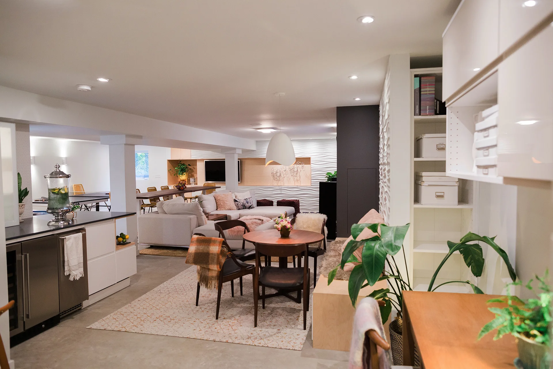
In this previously unfinished Anderson basement, the goal was to create a warm and inviting space that was suitable for all ages—young, old, and everyone in between. Programmatically, the basement needed to house a variety of spaces, an open living area, a wet bar, workout area, a full bathroom, storage, a bedroom, and an open office area.
Overall shot into the main living space of the basement. {Photography by Olga Polo Photography}
In this previously unfinished Anderson basement, the goal was to create a warm and inviting space that was suitable for all ages—young, old, and everyone in between. Programmatically, the basement needed to house a variety of spaces, an open living area, a wet bar, workout area, a full bathroom, storage, a bedroom, and an open office area.

Basement programmatic plan.

A few before photos of the unfinished space.
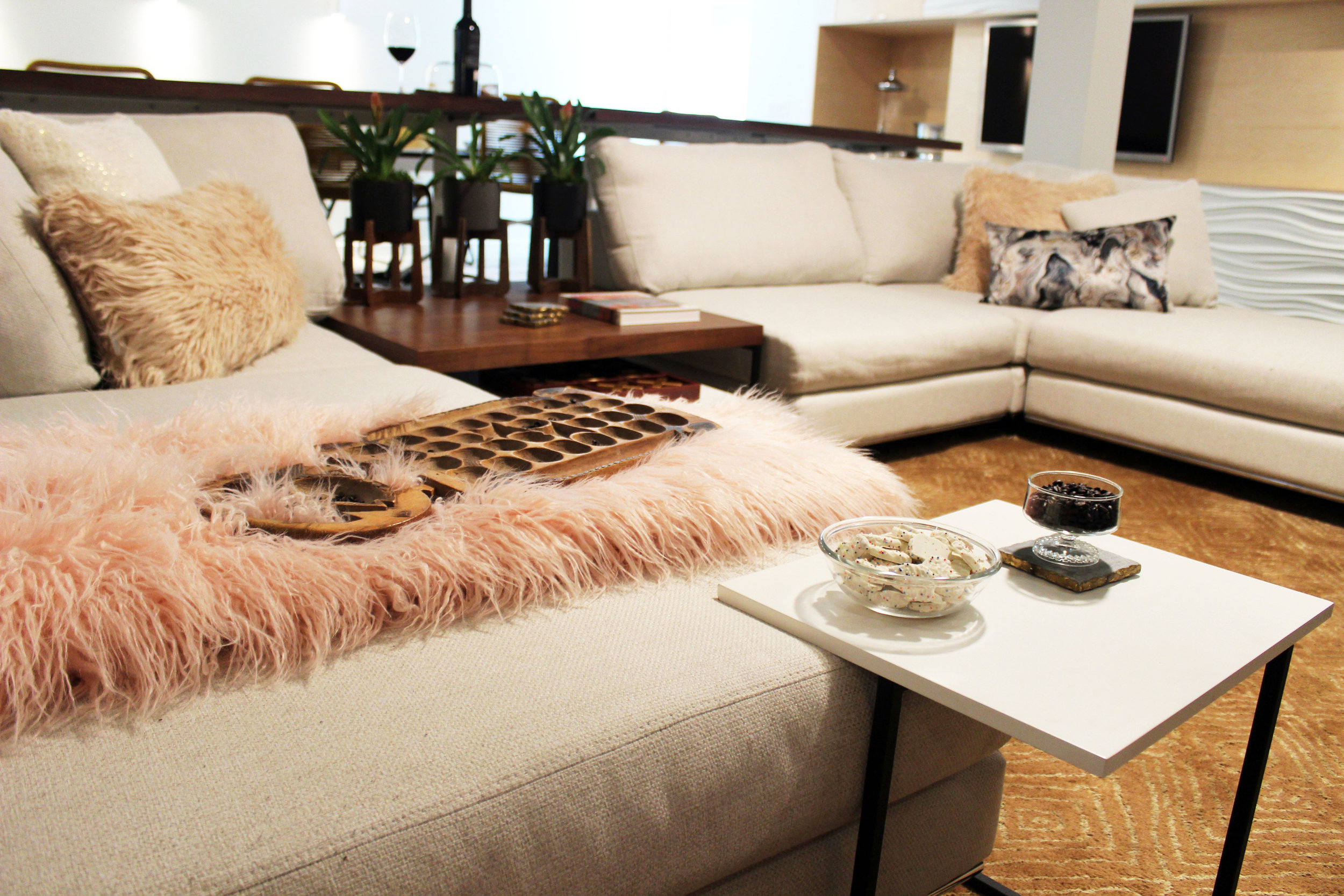
In the open living area, the homeowners wanted a central gathering spot for socializing. In this space, adjacent to the wet bar, the homeowners wanted several TVs for game days or watching movies, a ping pong table, a fireplace, and a modular sectional. The modular sectional can be arranged into double day beds for relaxing or broken apart and rearranged to accommodate a larger group.

Main living area facing the tv and fireplace wall. {Photography by Olga Polo Photography}

A variety of spaces make up this basement, from a ping-pong game area to comfy seating. {Photography by Olga Polo Photography}

The modular sectional, shown here in a u-shape, can be reconfigured to accumulate a variety of guests and their lounging needs. {Photography by Olga Polo Photography}
Flanking both sides of the dark fireplace and TV wall are Modular Arts panels, glass reinforced cast rock with a plant-based core, adding an architectural component to the clean lines throughout the remainder of the space.
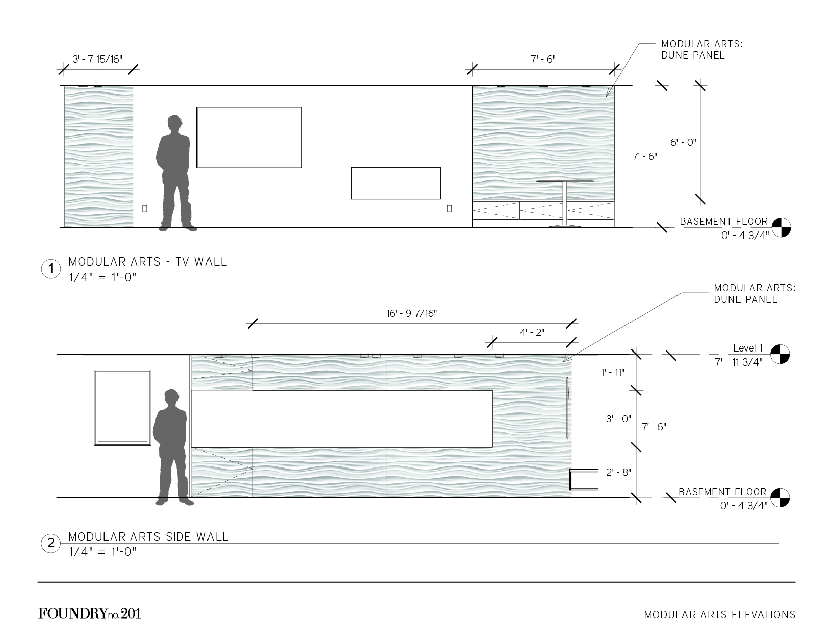
Elevations showing the Modular Arts locations.

Construction crew installing the Modular Arts panels.

Modular Arts walls flank the fireplace and TV wall, and provide contrast both in color and texture. {Photography by Olga Polo Photography}
The L-shaped wet bar provides ample storage and serving space. A custom corner unit trimmed out in birch contrasts with the white cabinetry and quartz countertop while also providing a unique display area. White penny tile with white grout above the countertop reads as a wall texture instead of a backsplash and compliments the Modular Arts on adjacent walls.

L-shaped wet bar with custom corner open shelving. {Photography by Olga Polo Photography}

Another view of the wet bar. {Photography by Olga Polo Photography}
We love how this basement turned out! Keep scrolling for a few more views of this comfy, cozy basement and sound off in the comments!
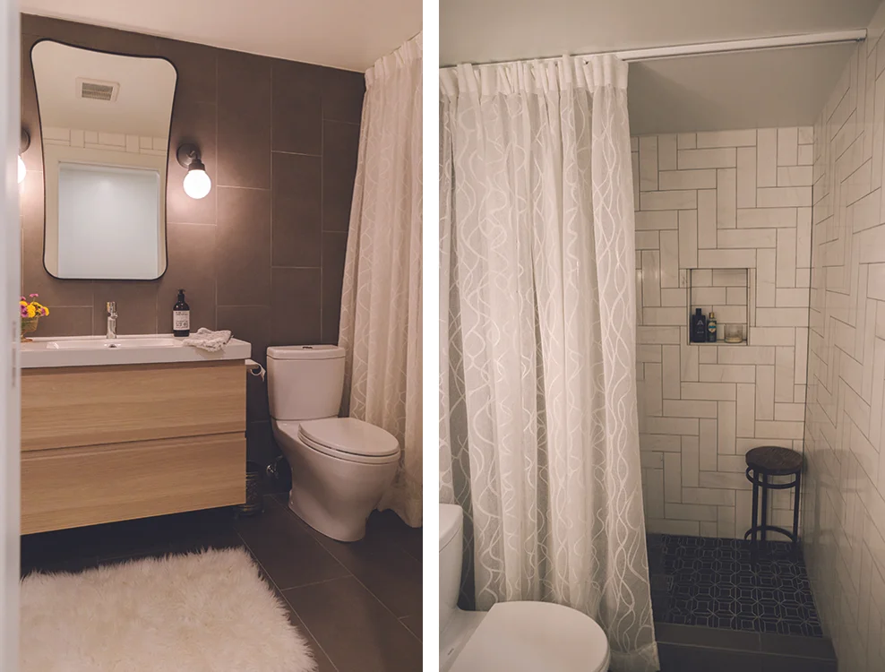
A full bathroom is around the corner from the wet bar. A simple, neutral palette compliments the remainder of the basement. {Photography by Olga Polo Photography}

A view from the main living space, through the eat-in area, and back into the workout room.
A detailed shot of the sectional.
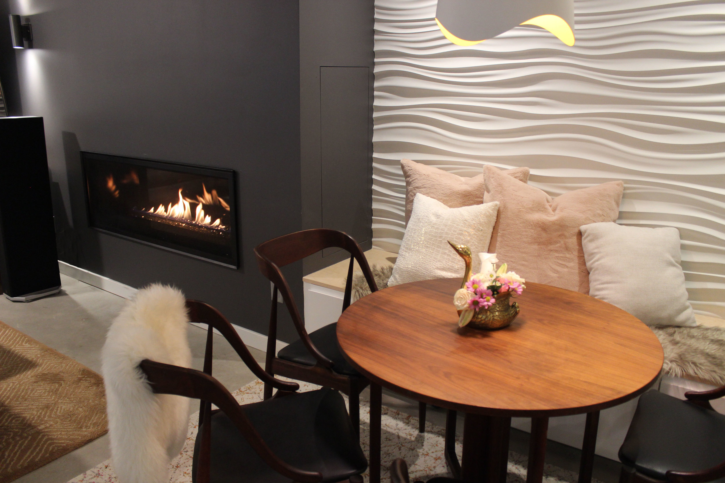
Close up of the eat-in area adjacent to the fireplace.
![CREATIVITY + COLLABORATION + CONNECTION x COFFEE + CONVERSATIONS [design build cincy 2018]](https://images.squarespace-cdn.com/content/v1/56684df62399a3b05844bd42/1541191110858-NB5HPJ7PUNJM0CIEI2U6/FOUNDRYno201_designbuildcincy2018_01.JPG)
CREATIVITY + COLLABORATION + CONNECTION x COFFEE + CONVERSATIONS [design build cincy 2018]
So, we viewed the glass half full, got creative, and kept the possibilities of this size booth at the forefront. We wanted to create a space in our 10’ x 20’ booth that would allow various users to be in the space at the same time, allow them to learn more about our collaborative design process, connect with us, and engage in meaningful dialogue with us about design.

Overall of our Design Build Cincy 2018 booth
Design Build Cincy 2018 is in the books! It was our second year doing the show, and our booth this year was FOUR TIMES the size it was last year! Why would you do that, you ask? Honestly, we don’t have a great answer for that. So, we viewed the glass half full, got creative, and kept the possibilities of this size booth at the forefront. We wanted to create a space in our 10’ x 20’ booth that would allow various users to be in the space at the same time, allow them to learn more about our collaborative design process, connect with us, and engage in meaningful dialogue with us about design.

The right side of our booth, showing the activation area and backside of the coffee bar.
We get a lot of questions as interior designers: Do you work with contractors/builders? How are you different than an architect? Do you work with architects? What value can you add to our project? We also get some less than flattering questions, like “well, what do you actually do?” and “Do you just pick out furniture?” So taking all that in, we thought we should show people what we do. People can find a pretty picture anywhere; hello Instagram, Pinterest, and Houzz. So it didn’t make a ton of sense for us to just show final pictures of our work because people would still be asking us what we do. We needed to show them, step by step, from an initial consultation meeting to the (sometimes messy) in-between steps before the final pretty picture. Graphically, we included a timeline of the design process, from pre-design to construction administration/ project management, showing our work in each phase of the project. We also included a materials palette in each of the two projects we showcased, which we have for each project we design, but this allowed for visitors of our space to experience the tactile side of our process.

#fromwhereistand: The design process is graphically shown on each print along with the work that happens in each phase of design.

Our design process and materials palette for Together on Treeridge. We don’t have final images of this project yet, only renderings, as the construction isn’t due to start until February/March.

A closer view of the materials palette for Together on Treeridge.
So that brings us to the next part of this title, coffee. In our tenure as business owners, we’ve had countless networking and introduction meetings at various coffee shops around the city, and we’ve met some phenomenal people, some even by happenstance. Example: discussing our women owned business certification with someone in a Starbucks while serendipitously sitting next to someone who works on the regional level of women owned business certifications. The coffee shop has become so engrained in our network and our networking, that it has become a part of us, part of our brand, and part of our growth. It only seemed fitting to include this aspect of us in our booth, and it would also provide us another platform in which to engage with end users and industry professionals.
Lucky for us, our friends at Tisdel and Custom Distributors represent and distribute Subzero-Wolf appliances, and they had the built-in coffee system on their showroom floor. After getting a few okays, we got the green light to install it in our booth for the weekend. To round out the collaborative experience, we designed co-branded mugs with ours and Custom Distributors logos, and to highlight additional local Cincy businesses, we talked to our friends at Redtree Art Gallery & Coffee Shop in Oakley about providing coffee beans.

Our coffee bar, complete with custom cabinetry, the Wolf coffee maker (on loan from Custom Distributors), and counterstool from Stellar Works (on loan from Design Lab).

The coffee bar, complete with some light reading.
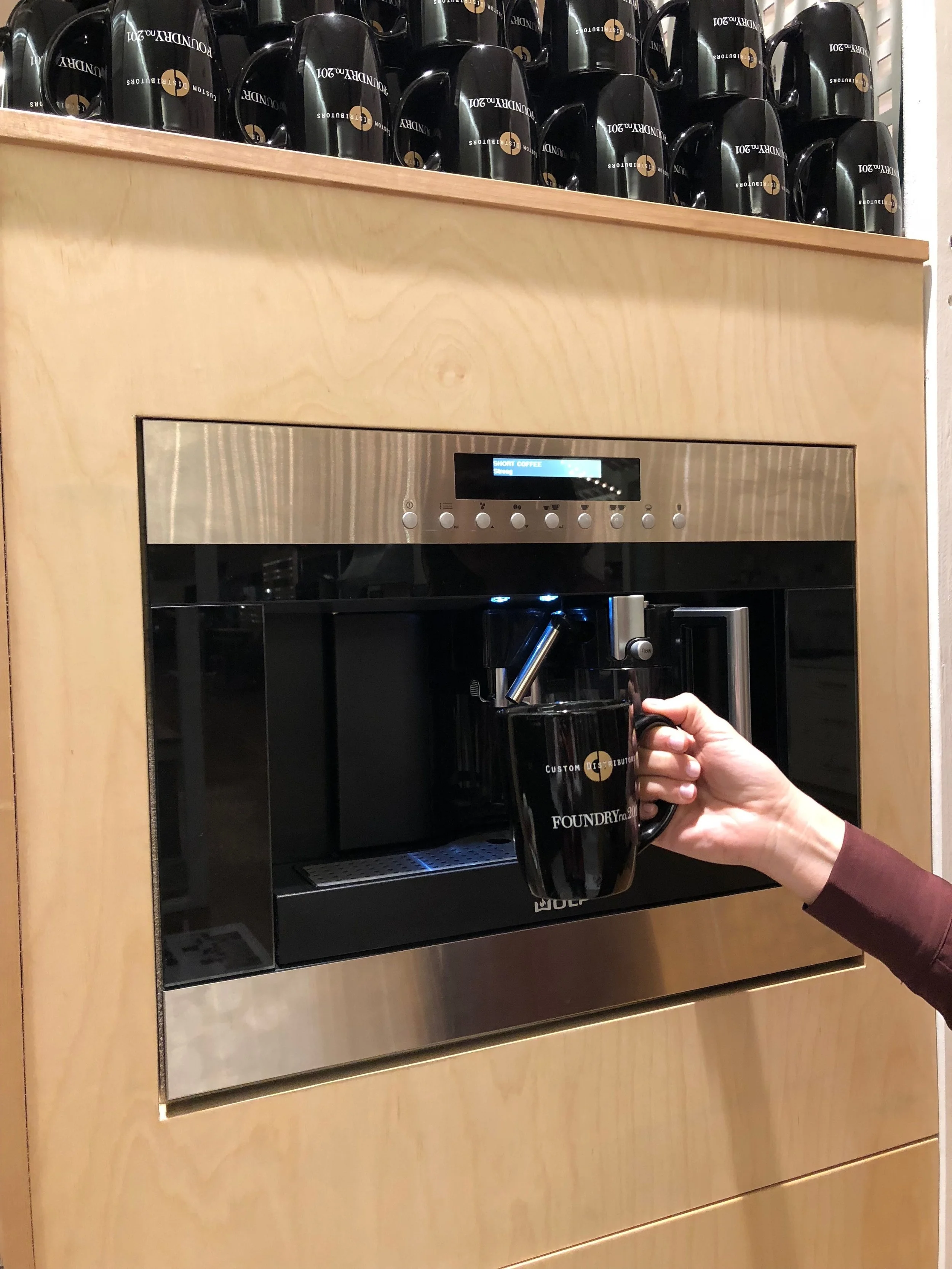
Making our first cup of the weekend!
The last component of our booth was an activation like the experiential portion of our booth last year. Using carpet yarn (which is used to weave carpet and carpet tiles) from Interface, users answered a few questions about themselves first—what word most described them (homeowner, builder/developer, educator, designer, architect) and their generation (matures, baby boomers, gen x-ers, millennials, gen z), and then moved into more design oriented questions. The first design question was “What do you prioritize in a design project?” and the answers were budget, function, quality, experience, and innovation. We asked a similar question last year, with more possible answers, and these were our top 5. The second design question was “What value does a designer add to your project?” Broken into three categories, creativity, collaboration, and connection, users were prompted to select one answer from each category.
We met some amazing industry professionals at the show as well as end-users. Now it’s time to get back to client projects as we head into the holidays. Can’t wait to start brainstorming our booth for next year!

Activation area of our booth with carpet yarn and design questions, creating a data map from our visitors.

A few of the answers in the activation area.

“The customer experience is always right.”

Riverside Retreat: from builder beige to vintage eclectic
We wanted to give them a tranquil master bathroom that met their functional requirements—useable storage, a large shower, and better lighting—and complimented the homeowner’s style: an eclectic mix of vintage, craftsman, mid-century modern pieces. The materials palette is a subtle mix of grays and whites, contrasted by black accents and a mid-tone wood vanity.

Riverside Retreat | A master bathroom redesign (and one of our favorite projects to date!)
When we first toured this Riverside home, we saw a lot of potential. One of the first things the homeowners said was, “This is the crappiest house we’ve ever bought!” Not entirely true—the location is phenomenal—minutes to downtown yet just far enough way to not feel like you’re *really* downtown—but the overall space was very builder grade—very beige and very boring.

Master bathroom before: very beige and very boring

Master bathroom before: another view into the shower
We wanted to give them a tranquil master bathroom that met their functional requirements—useable storage, a large shower, and better lighting—and complimented the homeowner’s style: an eclectic mix of vintage, craftsman, mid-century modern pieces. The materials palette is a subtle mix of grays and whites, contrasted by black accents and a mid-tone wood vanity.

Master bathroom materials palette: neutrals with accents of wood and black finishes.
The vanity is a vintage mid-century modern piece from one of our favorite local antique stores, Riverside Antiques. MCM purists fear not: the previous top was a pretty beat up laminate, and our construction crew kept the plumbing so tight that only the top outside drawers were affected. We then added a 6” mitered edge quartz top to achieve the standard vanity height. The result is a beautiful custom vanity that fits our clients’ style perfectly.
Check out some under construction photos as well as the afters below, and let us know what you think!

Framing of the new shower and large shower niche.

A view inside the shower showing the large shower niche and bench as backer board is going in before the tile.

Tile starting to go in, and the space starts to turn the corner.

Speaking of tile turning a corner… look at this corner!! How beautiful?! Our tile guy is truly phenomenal!

Creating the framework for the 6” mitered edge, quartz top that will go on top of this dresser to become the vanity.

Beautiful sconces from Sonneman going in. We love the contrast of the black finish with the more muted tones in the rest of the space.

The space is really coming together! The vanity is in place and awaiting its quartz countertop.

And she’s in—along with the mirrors and sconces! We love this eclectic mix of materials—it matches our client’s style perfectly.

The final result! Including a beloved fiddle leaf. The client loves plants—and so do we—so it was the perfect fit for a corner in this bathroom. {Photograph by Brooke Mullins Photography}

The vanity. We love many things in this bathroom but this may be our favorite. {Photograph by Brooke Mullins Photography}

The large walk in shower has a European feel with partial glass enclosure and Hansgrohe fixtures. {Photograph by Brooke Mullins Photography}

Another view into the shower from the opposite side of the vanity. {Photograph by Brooke Mullins Photography}

A few of the vanity from inside the shower. We found the vintage dresser at Riverside Antiques in Cincinnati and had our construction crew modify it so it could become the vanity. The 6” mitered edge top on top of the 30” dresser makes it the perfect height for a vanity.

Detail of the shower curb, showing the mix of materials in the space. {Photograph by Brooke Mullins Photography}

Close up of the vanity area. {Photograph by Brooke Mullins Photography}

A photograph of our photographer and her adorable son. Like mother, like son.

The Artwork of Nature
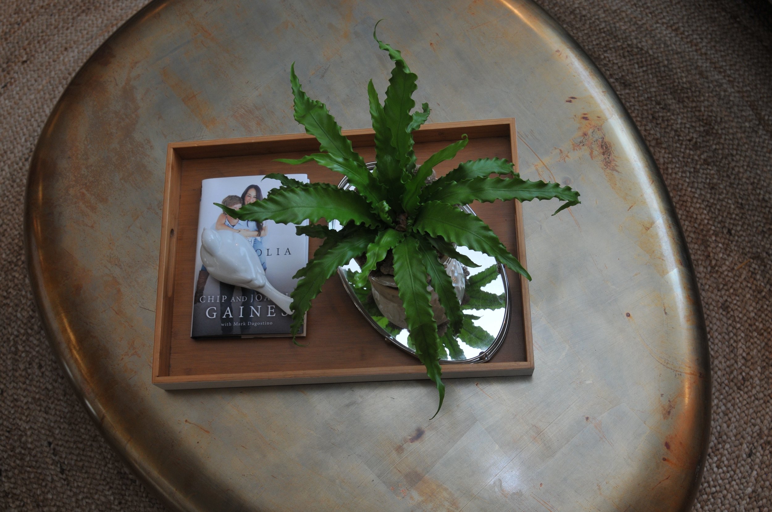
As the winter season slowly moves on, the lingering drear and cold begin to make us anxious for everything to “spring” to life again. Accessorizing indoor spaces with plants and fresh flowers is an easy way to brighten your surroundings and immediately give a space life. Like a piece of artwork, we value plants as much for their color as for their texture and form.

As the winter season slowly moves on, the lingering drear and cold begin to make us anxious for everything to “spring” to life again. Accessorizing indoor spaces with plants and fresh flowers is an easy way to brighten your surroundings and immediately give a space life. Like a piece of artwork, we value plants as much for their color as for their texture and form.

Designing with plants is the absolute key to adding the final touches to a space. Organic trees and plants that grow indoors help sharpen focus, reduce noise, purify the air, and bring calm and serenity to our busy lives.
One small plant with an organic form can add lots of texture and bring a touch of color to the center of a seating area.
Creating groupings of several smaller arrangements or plants of the same type create a simple focal point on a shelf, tabletop or window sill.

The dramatic effects an up light can create when placed at the base of larger plants enhance the overall atmosphere. Up lights accentuate the plant and soften the edges of a room. Placed in a corner, a large up-lit plant will make the space feel larger and create interesting shadows on the walls.

Getting anxious for the seasons to change as well? Click on the images to discover a few plants to add some life, bright color, and texture to your space. The gray of Old Man Winter will not get us down!


It's about farming, not hunting
Plant your seeds. Get to know people. Nurture your crops. Establish quality relationships over quantity relationships. “If your network is a mile wide and an inch deep, it will never be successful” (Misner). Aim for a rich harvest, not a quick kill.

Networking & Relationships: it was the topic at our monthly Rising Tide meeting today, and it's also the central concept surrounding BNI, another networking group we are proud members of.
So why are we talking about farming and hunting? Well, we have a lot to learn from history, anthropology, and our neighbors, especially when it comes to building relationships and building a business.
Let’s start from the beginning: hunting & gathering. Why did it work? Tools for hunting and gathering were easily constructed, requiring little effort and the “cost” was relatively small. With a small population, it’s the best return on investment for obtaining food. That is, until the population grows and local resources begin to be depleted. This causes them to travel further to obtain food, requiring more time and more effort. The result? A lower return on investment. Enter agriculture and farming.
Agriculture and farming require more effort and time to establish, but once the system is up and running, it requires less effort to maintain and expand as the population and need increases.
So what does all this have to do with growing a business? It takes effort and time to establish both your business and your network. The goal isn’t an instantaneous payoff, like the hunter. The goal is to establish something with longevity; something with purpose that can grow and be fruitful.
Plant your seeds. Get to know people. Nurture your crops. Establish quality relationships over quantity relationships. “If your network is a mile wide and an inch deep, it will never be successful” (Misner). Aim for a rich harvest, not a quick kill.


An Investment in Design
A well-designed office environment is not only an investment in the people who work there, but also an investment in their clients and their potential clients
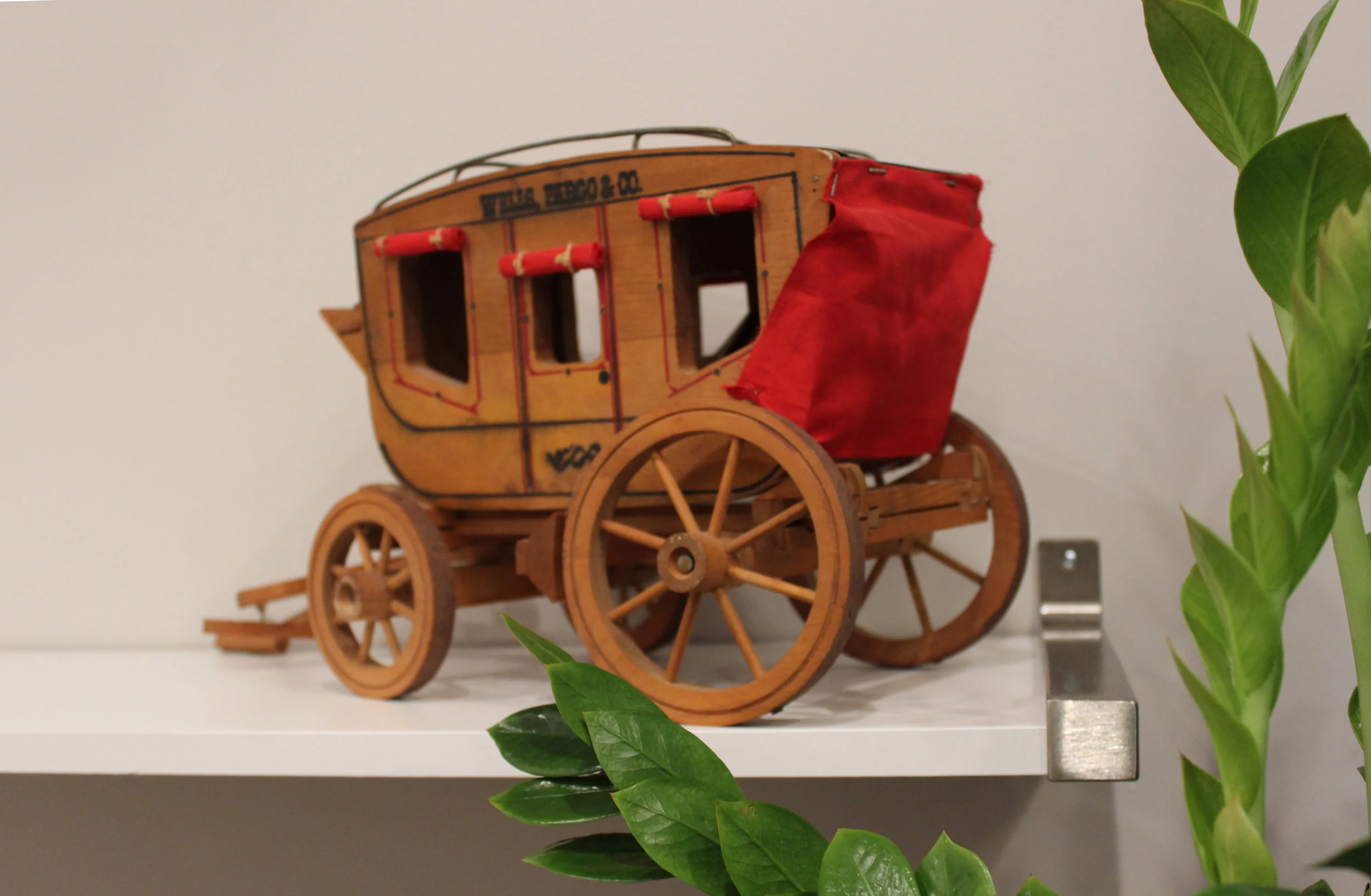
O-ho the Wells Fargo Wagon is a-comin' down the street.. // Details from the financial office's conference room
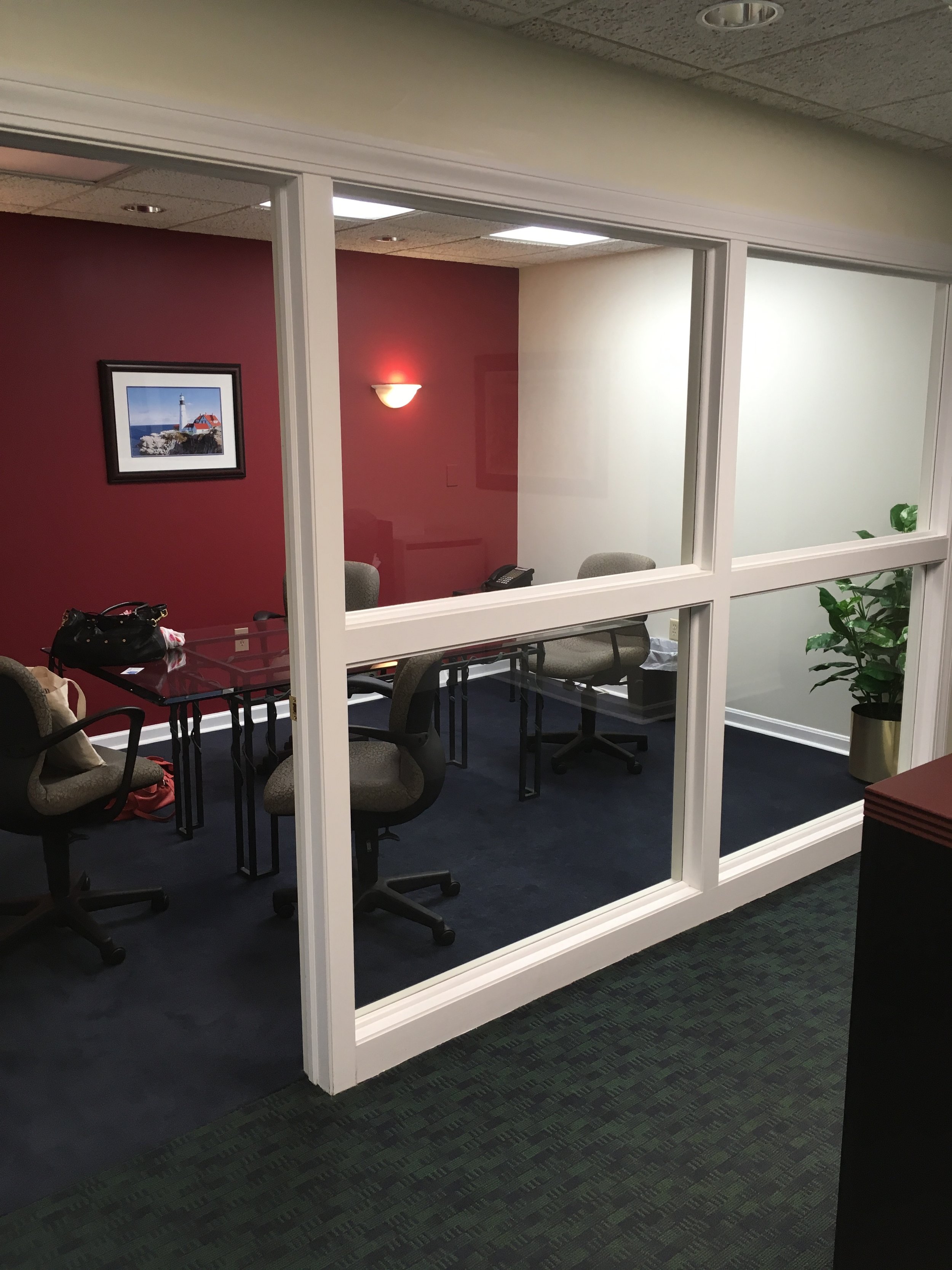
A well-designed office environment is not only an investment in the people who work there, but also an investment in their clients and their potential clients. A group of financial advisors in Anderson, Ohio wanted to update their office space to create a warm and inviting but professional experience for their customers. Working within the existing floor plan, we focused on the entry, the reception desk, and the conference room, to create updated, functional spaces.
In the entryway, a vintage, Drexel buffet with a leathered granite top acts as a snack and beverage station for employees and clients. Above the buffet, vintage financial ads add visual interest, stick to the brand, but aren’t too overpowering for the space.

Vintage advertisements add graphic elements to the space while staying on brand.

In the conference room, design details give depth to the overall neutral palette. Menswear inspired finishes—a dark conference table, burnt orange chairs with stitching details—and warm elements, such as the aesthetically, functionally, and sustainably carpet tile allow the office to be simple and sophisticated without compromising on style. The original artwork on the wall, “Bull vs. Bear,” provides an additional branded element in the space, speaking to the dichotomy of the global economy.
BEFORE: view into the conference room.

AFTER: A view into the conference room from the reception desk.

Close up of the "Bull vs. Bear" painting.

View from the conference room looking out into the reception area.

Another view from the conference room, looking out into the reception area.
We loved updating this financial office and are incredibly thankful to the group of financial advisors for trusting us to redesign their space.
Hope you enjoyed the photos! Cheers!