
![CREATIVITY + COLLABORATION + CONNECTION x COFFEE + CONVERSATIONS [design build cincy 2018]](https://images.squarespace-cdn.com/content/v1/56684df62399a3b05844bd42/1541191110858-NB5HPJ7PUNJM0CIEI2U6/FOUNDRYno201_designbuildcincy2018_01.JPG)
CREATIVITY + COLLABORATION + CONNECTION x COFFEE + CONVERSATIONS [design build cincy 2018]
So, we viewed the glass half full, got creative, and kept the possibilities of this size booth at the forefront. We wanted to create a space in our 10’ x 20’ booth that would allow various users to be in the space at the same time, allow them to learn more about our collaborative design process, connect with us, and engage in meaningful dialogue with us about design.

Overall of our Design Build Cincy 2018 booth
Design Build Cincy 2018 is in the books! It was our second year doing the show, and our booth this year was FOUR TIMES the size it was last year! Why would you do that, you ask? Honestly, we don’t have a great answer for that. So, we viewed the glass half full, got creative, and kept the possibilities of this size booth at the forefront. We wanted to create a space in our 10’ x 20’ booth that would allow various users to be in the space at the same time, allow them to learn more about our collaborative design process, connect with us, and engage in meaningful dialogue with us about design.

The right side of our booth, showing the activation area and backside of the coffee bar.
We get a lot of questions as interior designers: Do you work with contractors/builders? How are you different than an architect? Do you work with architects? What value can you add to our project? We also get some less than flattering questions, like “well, what do you actually do?” and “Do you just pick out furniture?” So taking all that in, we thought we should show people what we do. People can find a pretty picture anywhere; hello Instagram, Pinterest, and Houzz. So it didn’t make a ton of sense for us to just show final pictures of our work because people would still be asking us what we do. We needed to show them, step by step, from an initial consultation meeting to the (sometimes messy) in-between steps before the final pretty picture. Graphically, we included a timeline of the design process, from pre-design to construction administration/ project management, showing our work in each phase of the project. We also included a materials palette in each of the two projects we showcased, which we have for each project we design, but this allowed for visitors of our space to experience the tactile side of our process.

#fromwhereistand: The design process is graphically shown on each print along with the work that happens in each phase of design.

Our design process and materials palette for Together on Treeridge. We don’t have final images of this project yet, only renderings, as the construction isn’t due to start until February/March.

A closer view of the materials palette for Together on Treeridge.
So that brings us to the next part of this title, coffee. In our tenure as business owners, we’ve had countless networking and introduction meetings at various coffee shops around the city, and we’ve met some phenomenal people, some even by happenstance. Example: discussing our women owned business certification with someone in a Starbucks while serendipitously sitting next to someone who works on the regional level of women owned business certifications. The coffee shop has become so engrained in our network and our networking, that it has become a part of us, part of our brand, and part of our growth. It only seemed fitting to include this aspect of us in our booth, and it would also provide us another platform in which to engage with end users and industry professionals.
Lucky for us, our friends at Tisdel and Custom Distributors represent and distribute Subzero-Wolf appliances, and they had the built-in coffee system on their showroom floor. After getting a few okays, we got the green light to install it in our booth for the weekend. To round out the collaborative experience, we designed co-branded mugs with ours and Custom Distributors logos, and to highlight additional local Cincy businesses, we talked to our friends at Redtree Art Gallery & Coffee Shop in Oakley about providing coffee beans.

Our coffee bar, complete with custom cabinetry, the Wolf coffee maker (on loan from Custom Distributors), and counterstool from Stellar Works (on loan from Design Lab).

The coffee bar, complete with some light reading.
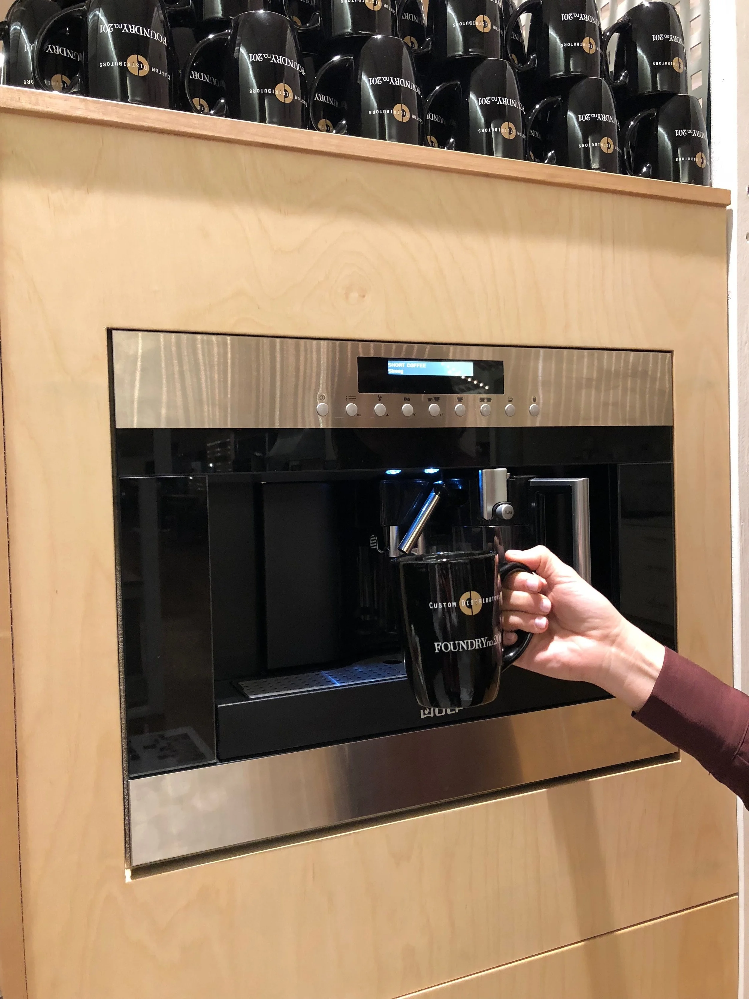
Making our first cup of the weekend!
The last component of our booth was an activation like the experiential portion of our booth last year. Using carpet yarn (which is used to weave carpet and carpet tiles) from Interface, users answered a few questions about themselves first—what word most described them (homeowner, builder/developer, educator, designer, architect) and their generation (matures, baby boomers, gen x-ers, millennials, gen z), and then moved into more design oriented questions. The first design question was “What do you prioritize in a design project?” and the answers were budget, function, quality, experience, and innovation. We asked a similar question last year, with more possible answers, and these were our top 5. The second design question was “What value does a designer add to your project?” Broken into three categories, creativity, collaboration, and connection, users were prompted to select one answer from each category.
We met some amazing industry professionals at the show as well as end-users. Now it’s time to get back to client projects as we head into the holidays. Can’t wait to start brainstorming our booth for next year!

Activation area of our booth with carpet yarn and design questions, creating a data map from our visitors.

A few of the answers in the activation area.

“The customer experience is always right.”
It's Officially Wedding Season!

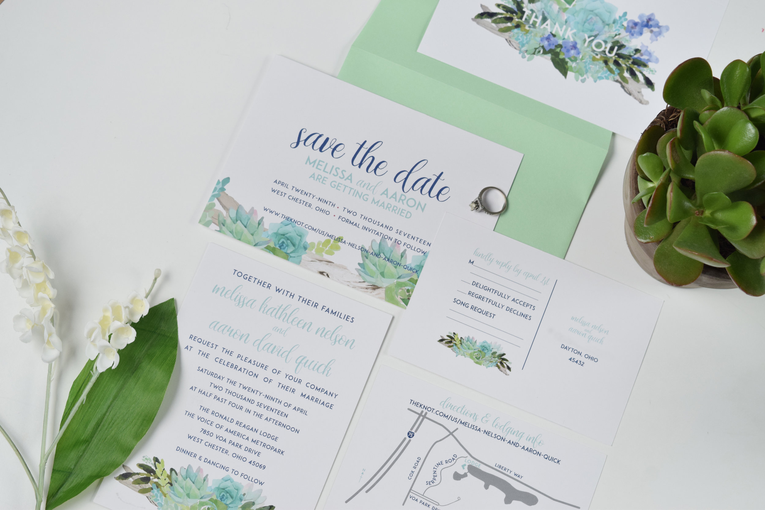
May is already halfway over (where does time go?!) and there’s been a lot to celebrate this month! We celebrated momma’s everywhere last weekend, we had margaritas on the 5th, and it’s officially wedding season! We love when clients come to us with the task of designing their wedding invitation package. From the Save the Dates all the way to the thank you notes, we see our slice of the wedding pie (or cake) as an important tool in helping the bride and groom to hone in on their wedding vision. The process is very similar to a branding project, helping a client form their identity and establish an essence and distinct look.
We recently worked with a client in developing their invitation package, complete with Save the Dates, RSVPs, maps, programs, and thank you cards. The wedding venue, Voice of America MetroPark, is a casual, outdoor venue, and the client wanted the invitation package to be welcoming and casual, but also maintain a level of sophistication. Succulents and simple florals, similar to those on the invitation package, were included at the venue on tablescapes, bouquets, and boutonnières.
Scroll through to see some of our favorite images of the invitation package. We hope you love the final product as much as we do!


The "sweetest" Bat Mitzvah invitations

Overall showing the candy and sweets icon motif, fun colors, and bold fonts.
One of our favorite projects thus far has been these "sweet" Bat Mitzvah invitations. It's not every day that you get to design for a 13 year old, but when you do, you can use fun colors, graphic motifs, and bold fonts.
Focusing on simplistic and bold design, the Bat Mitzvah invitation package challenges the notion of traditional invitation packaging. The outside "envelope" unfolds, revealing two invitations; then flips over and shows the RSVP information.

With a non-traditional envelope, you have non-traditional how to's
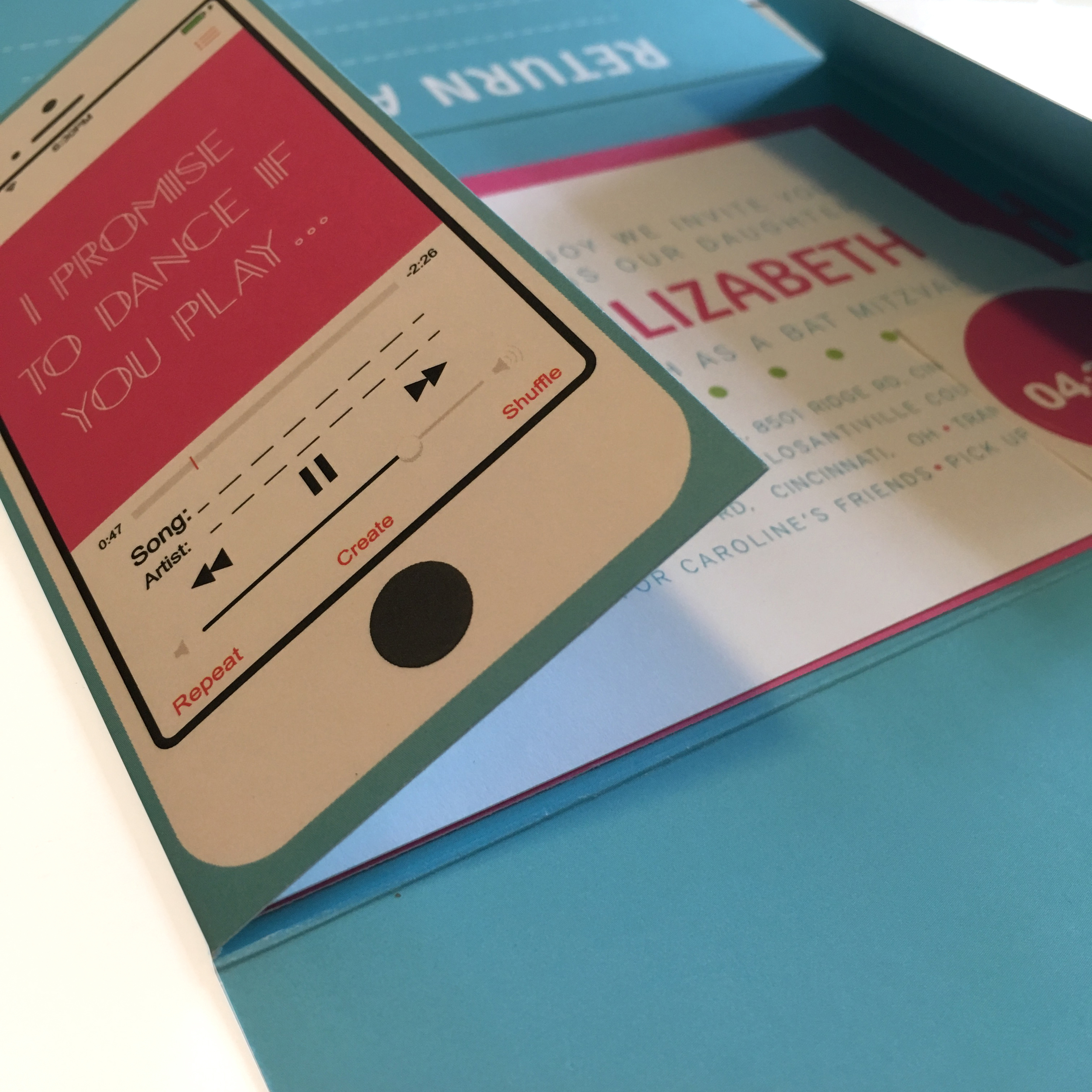
While opening the invitation, one notices the song request on the reverse side of the "envelope."

The back of the "envelope" is also branded, showing the candy motif as well as the lollipop "i" in Caroline's name. The "envelope" opens to show the main ceremony invite.

The party invitation expands on the candy motif, shown here in various colors and applications.

The "envelope" flipped over to show the RSVP info on the left and a song request on the right.
The guest then fills out the RSVP information, refolds the "envelope," places a sticker on the back, fills in their address, and sends it back in the mail.

The bold typeface of the date became a reoccurring motif in the invitation package.

Return address showing the lollipop "i" in Caroline's name.
The bold color palette and simple typefaces keep a fun, consistent, graphic presentation all the way to thank you notes.
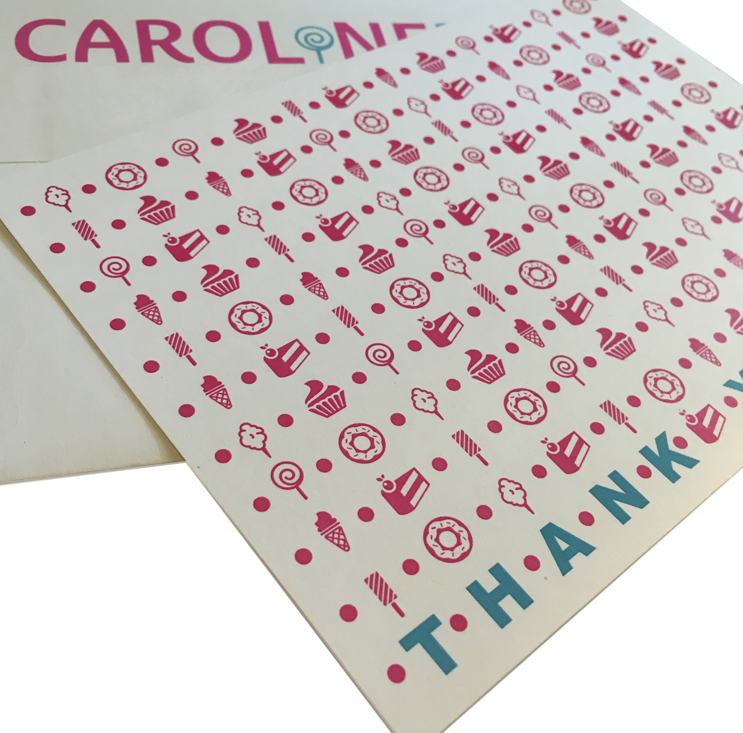
Custom thank you notes with the candy motif.
The candy and sweets icon motif, the lollipop "i," and the fun colors all reinforce the Bat Mitzvah's theme, "Sweet Caroline." This was one of our favorite projects to date, and we cannot wait to design more.