

Cramped Kenwood kitchen updated for a young family
The original kitchen in this Kenwood home was a little dark, a little crowded, and a whole lot of not functional for a family of 4. The lack of countertop space was forcing this homeowner to use a moveable butcher block island every evening for prep space, but the lack of space around that prep space was forcing the client to move the island out of the space after prep was done since there wasn’t much space to get around or through.
The original kitchen in this Kenwood home was a little dark, a little crowded, and a whole lot of not functional for a family of 4. The lack of countertop space was forcing this homeowner to use a moveable butcher block island every evening for prep space, but the lack of space around that prep space was forcing the client to move the island out of the space after prep was done since there wasn’t much space to get around or through.

One corner of the kitchen as demo began. The opening to the left of the door is where the homeowner kept their moveable, butcher block island.

The opposite corner of the kitchen as demo began.
The solution was to remove the wall between the existing kitchen and a less-used formal dining room, doubling the footprint of the kitchen. From there, we opened the newly created kitchen to a previous formal living room, creating a comfy, cozy, and open concept on the first floor. To create this almost 18’ opening, we added an LVL for structural support and recessed it as far as we could.

Removing those walls made a HUGE difference! The new footprint of this soon-to-be kitchen is massive.
With the kitchen now open to the front of the house and in the back of the house—wherever you are, you can almost always see the kitchen—we created an L-shaped kitchen to create a good working triangle and vent the cooktop to the exterior. The 10’-6” island creates the perfect prep space or gathering space for kid meals or gathering with friends. Since we had white perimeter cabinets and a navy-gray stain on the island, we added Cambria to both the island and perimeter cabinetry to keep things cohesive.

Countertop install day!
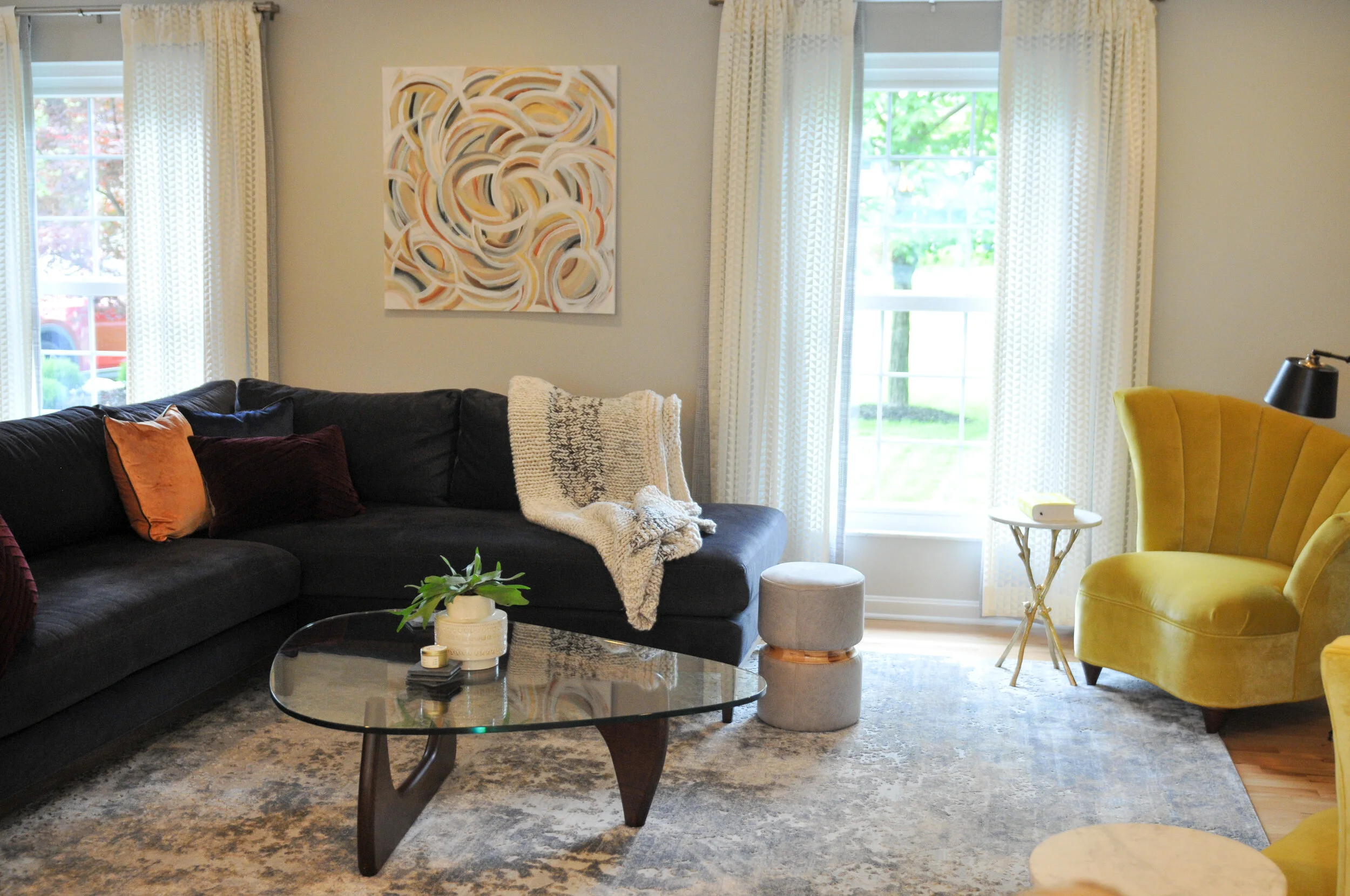
Once the kitchen remodel was winding down, we began to address the front living room. We kept things simple but sophisticated on the large rug (which is almost the inverse of the quartz countertops) and dark sectional. We added pops of interest by reupholstering a set of funky 1980s chairs in a chartreuse velvet and added two layers of graphic sheers on the window treatments for both privacy and fun.
The result is a first floor that feels open and inviting while fulfilling the functional and aesthetics needs of a young family.

Photograph by Brooke Mullins Photography

Photograph by Brooke Mullins Photography

Photograph by Brooke Mullins Photography

Photograph by Brooke Mullins Photography
Photograph by Brooke Mullins Photography

Photograph by Brooke Mullins Photography

Unfinished to Entertaining Haven: a Treeknoll basement
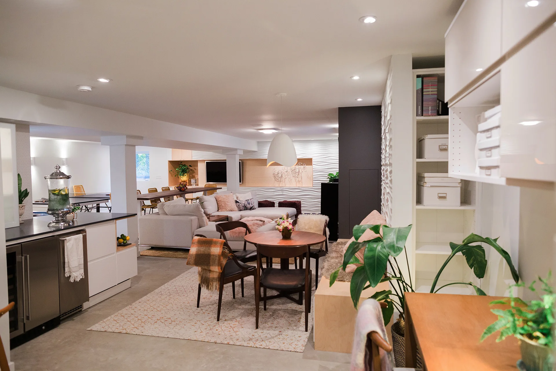
In this previously unfinished Anderson basement, the goal was to create a warm and inviting space that was suitable for all ages—young, old, and everyone in between. Programmatically, the basement needed to house a variety of spaces, an open living area, a wet bar, workout area, a full bathroom, storage, a bedroom, and an open office area.
Overall shot into the main living space of the basement. {Photography by Olga Polo Photography}
In this previously unfinished Anderson basement, the goal was to create a warm and inviting space that was suitable for all ages—young, old, and everyone in between. Programmatically, the basement needed to house a variety of spaces, an open living area, a wet bar, workout area, a full bathroom, storage, a bedroom, and an open office area.

Basement programmatic plan.

A few before photos of the unfinished space.
In the open living area, the homeowners wanted a central gathering spot for socializing. In this space, adjacent to the wet bar, the homeowners wanted several TVs for game days or watching movies, a ping pong table, a fireplace, and a modular sectional. The modular sectional can be arranged into double day beds for relaxing or broken apart and rearranged to accommodate a larger group.

Main living area facing the tv and fireplace wall. {Photography by Olga Polo Photography}

A variety of spaces make up this basement, from a ping-pong game area to comfy seating. {Photography by Olga Polo Photography}

The modular sectional, shown here in a u-shape, can be reconfigured to accumulate a variety of guests and their lounging needs. {Photography by Olga Polo Photography}
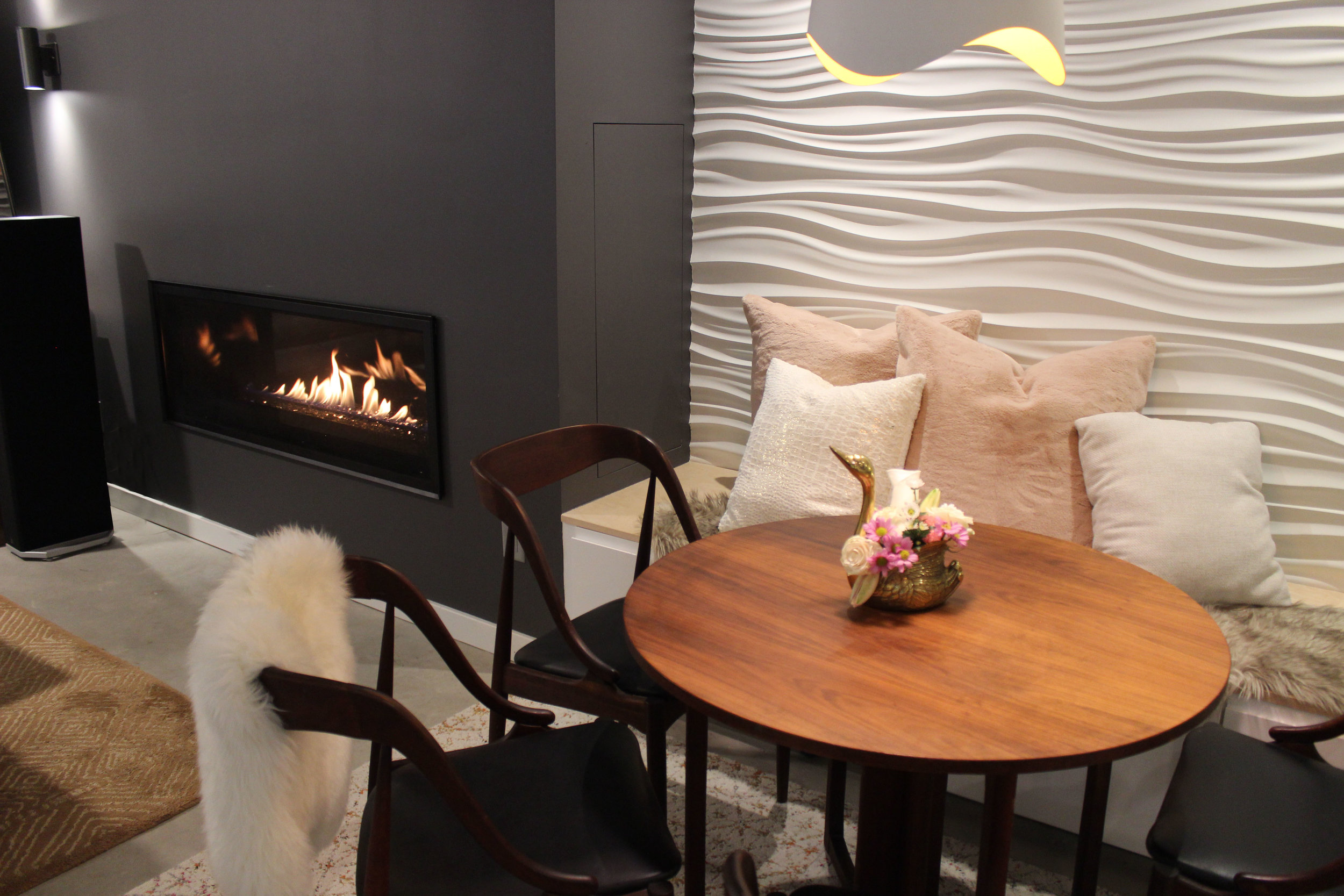
Flanking both sides of the dark fireplace and TV wall are Modular Arts panels, glass reinforced cast rock with a plant-based core, adding an architectural component to the clean lines throughout the remainder of the space.
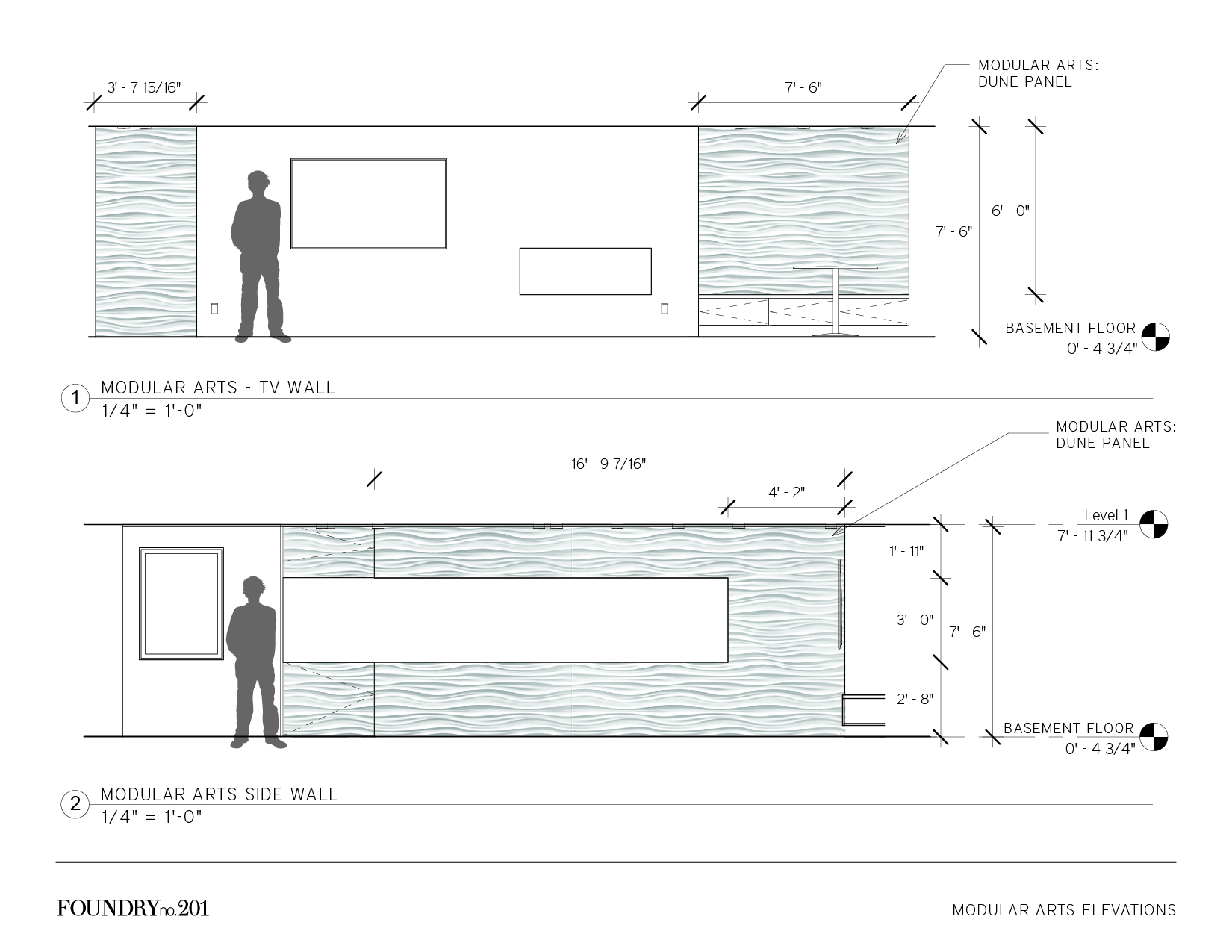
Elevations showing the Modular Arts locations.

Construction crew installing the Modular Arts panels.

Modular Arts walls flank the fireplace and TV wall, and provide contrast both in color and texture. {Photography by Olga Polo Photography}
The L-shaped wet bar provides ample storage and serving space. A custom corner unit trimmed out in birch contrasts with the white cabinetry and quartz countertop while also providing a unique display area. White penny tile with white grout above the countertop reads as a wall texture instead of a backsplash and compliments the Modular Arts on adjacent walls.

L-shaped wet bar with custom corner open shelving. {Photography by Olga Polo Photography}

Another view of the wet bar. {Photography by Olga Polo Photography}
We love how this basement turned out! Keep scrolling for a few more views of this comfy, cozy basement and sound off in the comments!
A full bathroom is around the corner from the wet bar. A simple, neutral palette compliments the remainder of the basement. {Photography by Olga Polo Photography}

A view from the main living space, through the eat-in area, and back into the workout room.
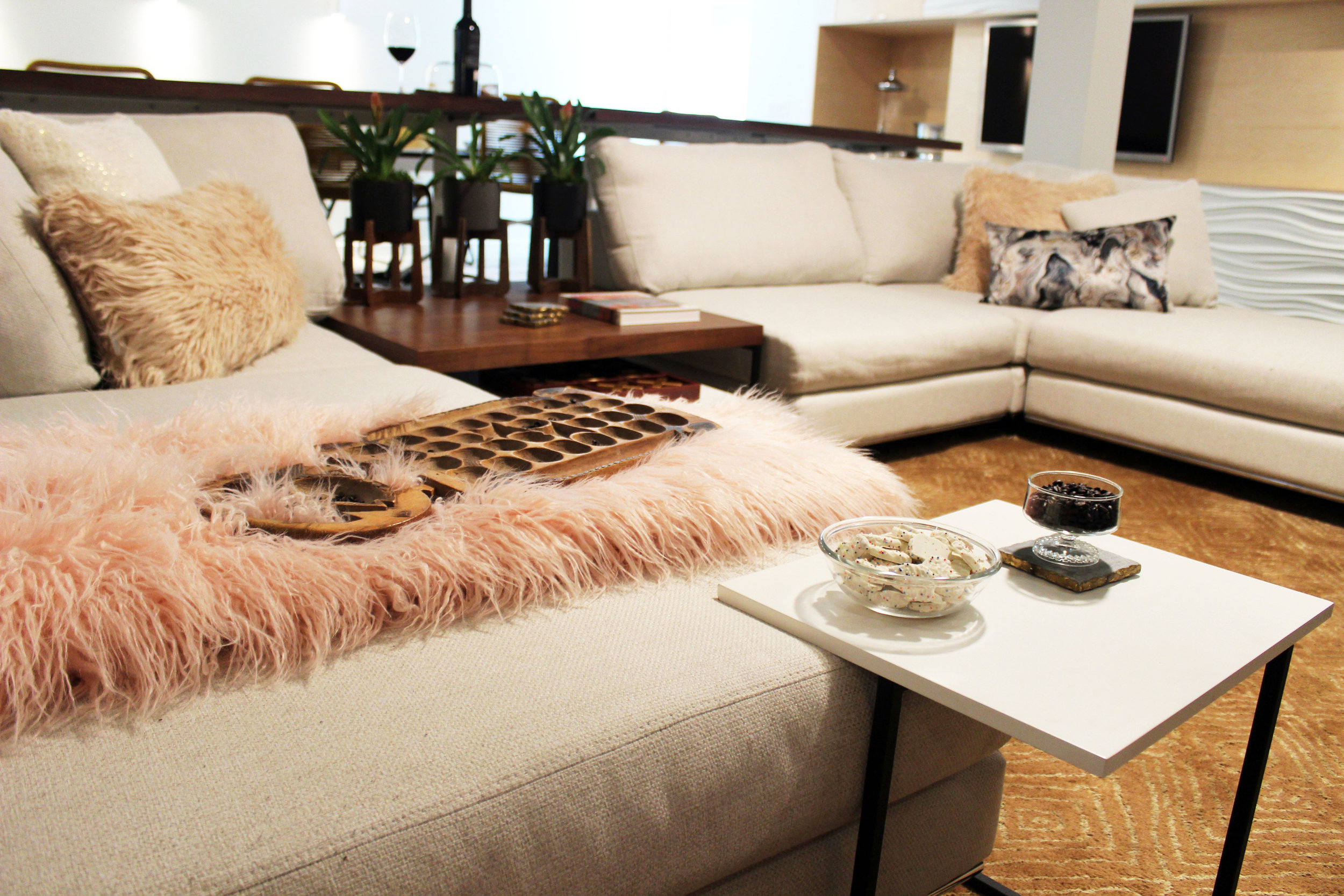
A detailed shot of the sectional.
Close up of the eat-in area adjacent to the fireplace.

Riverside Retreat: from builder beige to vintage eclectic
We wanted to give them a tranquil master bathroom that met their functional requirements—useable storage, a large shower, and better lighting—and complimented the homeowner’s style: an eclectic mix of vintage, craftsman, mid-century modern pieces. The materials palette is a subtle mix of grays and whites, contrasted by black accents and a mid-tone wood vanity.

Riverside Retreat | A master bathroom redesign (and one of our favorite projects to date!)
When we first toured this Riverside home, we saw a lot of potential. One of the first things the homeowners said was, “This is the crappiest house we’ve ever bought!” Not entirely true—the location is phenomenal—minutes to downtown yet just far enough way to not feel like you’re *really* downtown—but the overall space was very builder grade—very beige and very boring.

Master bathroom before: very beige and very boring

Master bathroom before: another view into the shower
We wanted to give them a tranquil master bathroom that met their functional requirements—useable storage, a large shower, and better lighting—and complimented the homeowner’s style: an eclectic mix of vintage, craftsman, mid-century modern pieces. The materials palette is a subtle mix of grays and whites, contrasted by black accents and a mid-tone wood vanity.

Master bathroom materials palette: neutrals with accents of wood and black finishes.
The vanity is a vintage mid-century modern piece from one of our favorite local antique stores, Riverside Antiques. MCM purists fear not: the previous top was a pretty beat up laminate, and our construction crew kept the plumbing so tight that only the top outside drawers were affected. We then added a 6” mitered edge quartz top to achieve the standard vanity height. The result is a beautiful custom vanity that fits our clients’ style perfectly.
Check out some under construction photos as well as the afters below, and let us know what you think!

Framing of the new shower and large shower niche.

A view inside the shower showing the large shower niche and bench as backer board is going in before the tile.

Tile starting to go in, and the space starts to turn the corner.

Speaking of tile turning a corner… look at this corner!! How beautiful?! Our tile guy is truly phenomenal!

Creating the framework for the 6” mitered edge, quartz top that will go on top of this dresser to become the vanity.

Beautiful sconces from Sonneman going in. We love the contrast of the black finish with the more muted tones in the rest of the space.

The space is really coming together! The vanity is in place and awaiting its quartz countertop.

And she’s in—along with the mirrors and sconces! We love this eclectic mix of materials—it matches our client’s style perfectly.

The final result! Including a beloved fiddle leaf. The client loves plants—and so do we—so it was the perfect fit for a corner in this bathroom. {Photograph by Brooke Mullins Photography}

The vanity. We love many things in this bathroom but this may be our favorite. {Photograph by Brooke Mullins Photography}

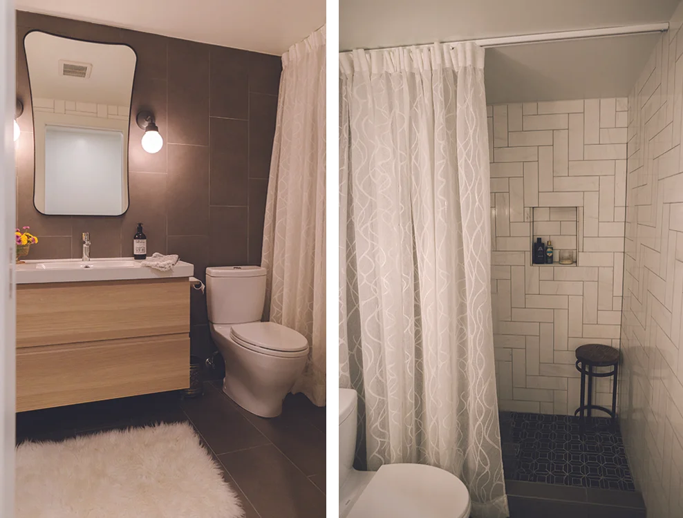
The large walk in shower has a European feel with partial glass enclosure and Hansgrohe fixtures. {Photograph by Brooke Mullins Photography}

Another view into the shower from the opposite side of the vanity. {Photograph by Brooke Mullins Photography}

A few of the vanity from inside the shower. We found the vintage dresser at Riverside Antiques in Cincinnati and had our construction crew modify it so it could become the vanity. The 6” mitered edge top on top of the 30” dresser makes it the perfect height for a vanity.

Detail of the shower curb, showing the mix of materials in the space. {Photograph by Brooke Mullins Photography}

Close up of the vanity area. {Photograph by Brooke Mullins Photography}

A photograph of our photographer and her adorable son. Like mother, like son.